
Distinct products.
One connected brand.
Independent brand exploration
Creative direction · Brand design · Packaging system · Digital concept
I wanted to see how five Triquetra products could feel like one family while keeping their individual character. I explored three packaging directions, then carried the strongest one into identity, imagery and a desktop homepage concept.
This self-initiated concept was not commissioned by Triquetra.

01 / EXPLORATION
Finding the shared structure.
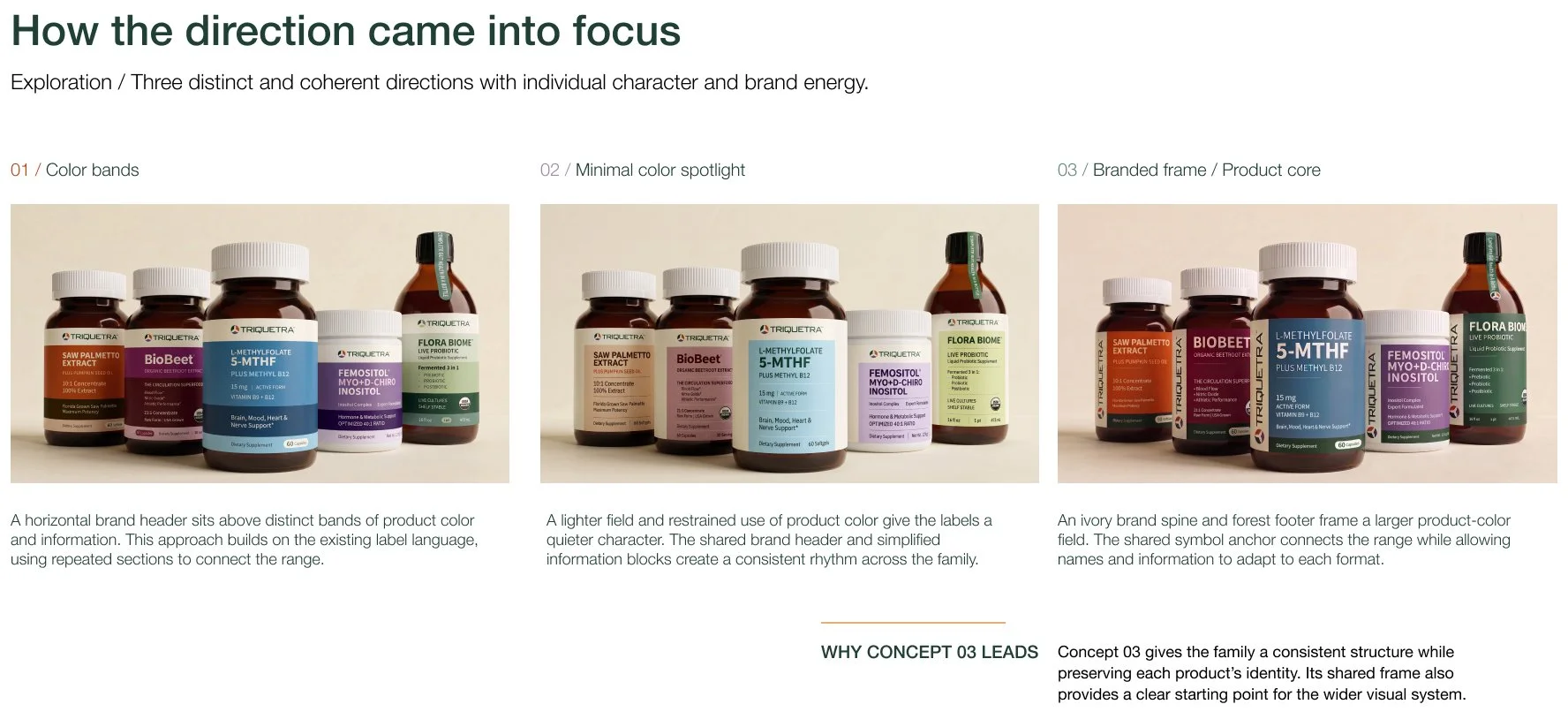
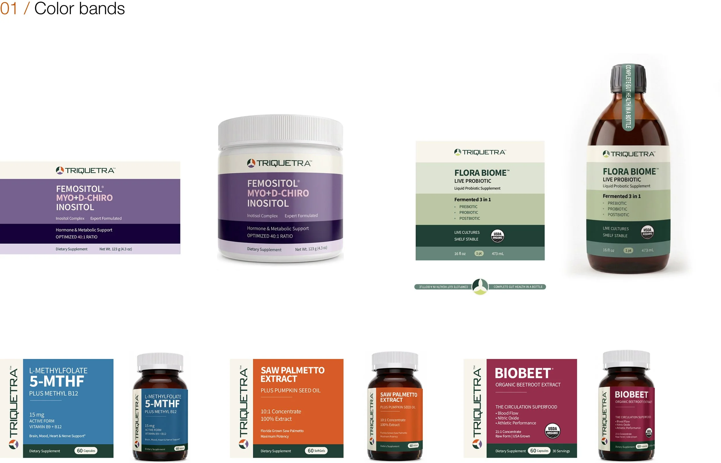
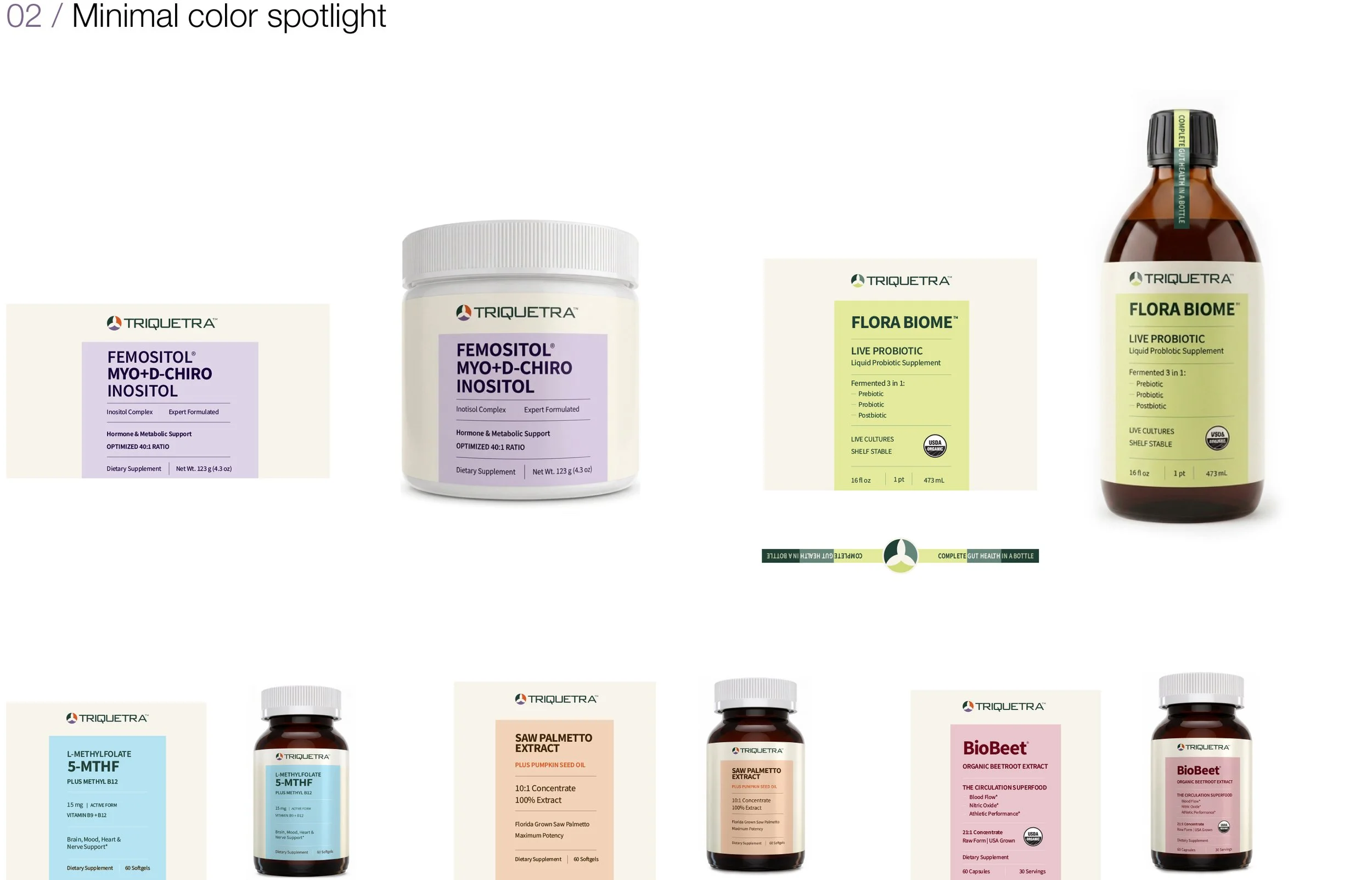
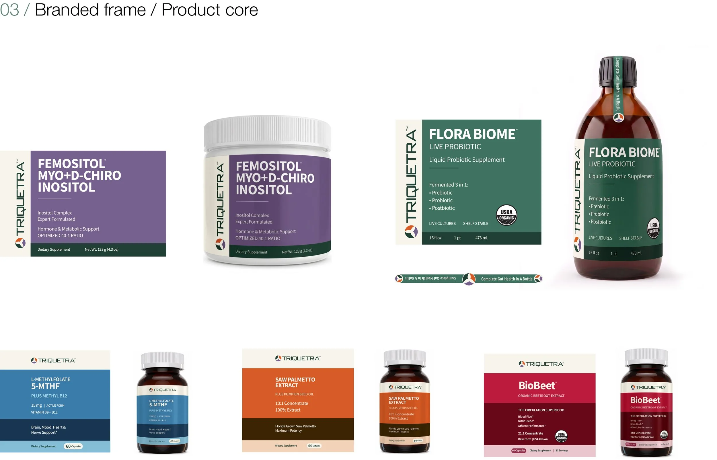
I explored three ways to organize the range: horizontal color bands, a quieter layout with a small field of color, and a shared frame around a larger color field. The third gave the brand a consistent place on every label while leaving room for each formula to stand out.
02 / PACKAGING SYSTEM
The frame that connects the family.
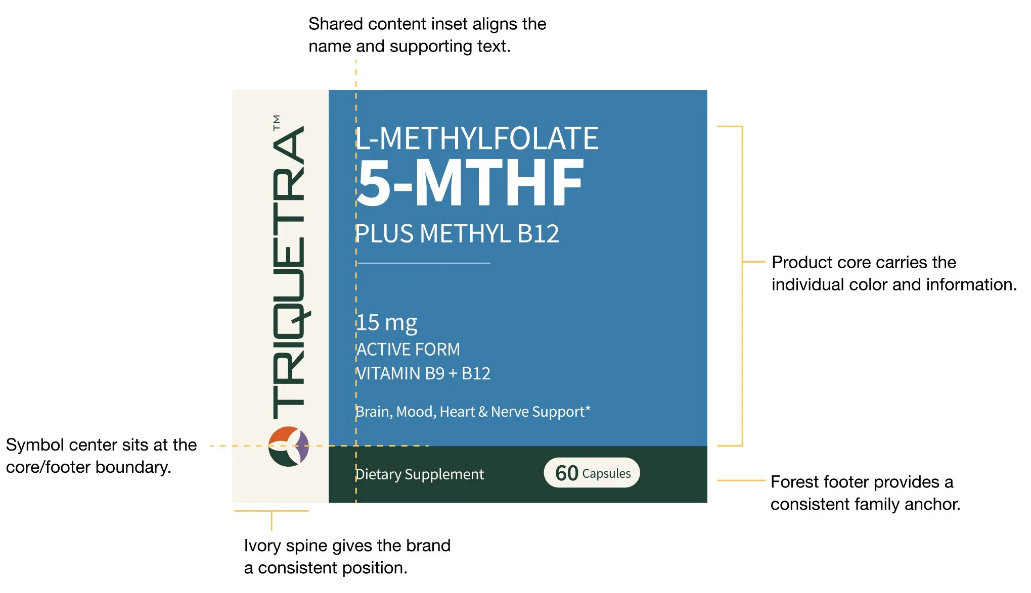
An ivory spine carries the wordmark, a colored field identifies the formula, and a Deep Forest footer anchors the label. The symbol sits where the color field meets the footer. Those relationships stay consistent as the product name, quantity and proportions adapt to each format.
03 / VISUAL LANGUAGE
A common palette, room for individuality.
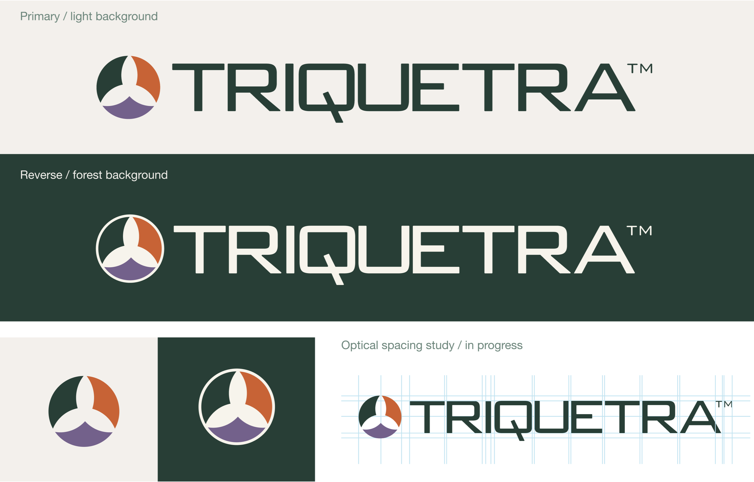
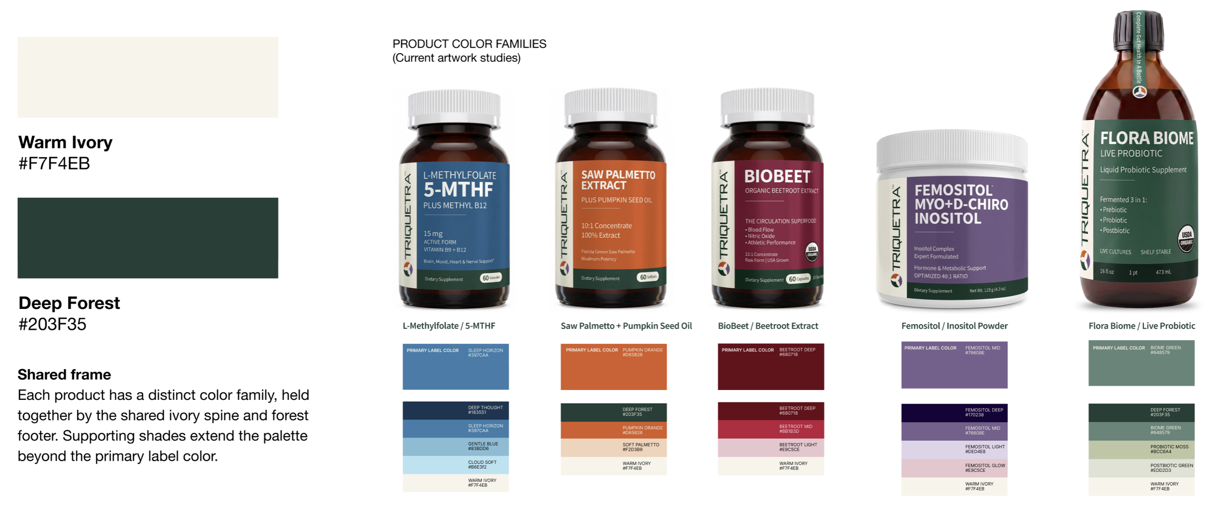
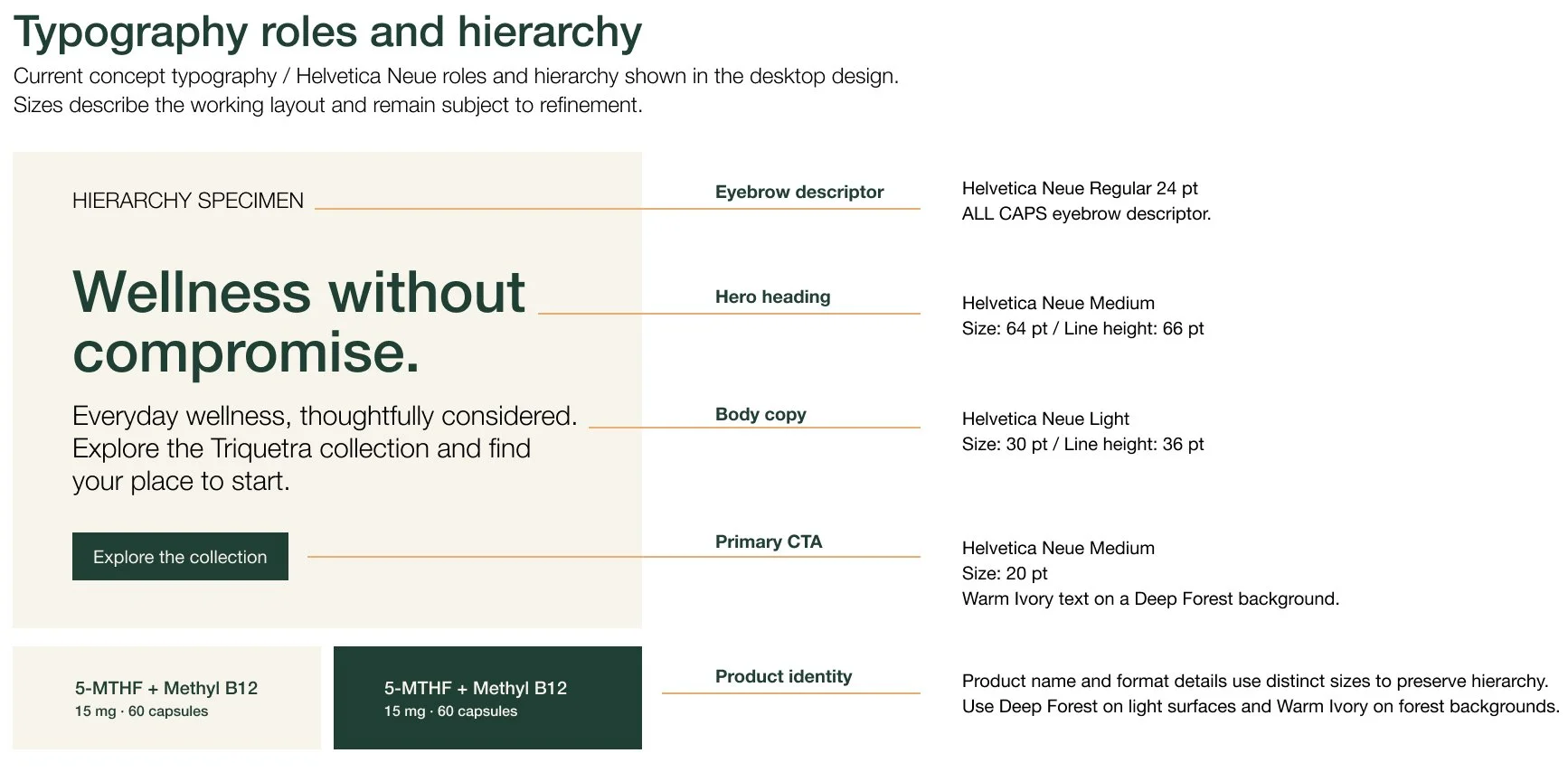
Warm Ivory and Deep Forest give the system a consistent base. Product colors do the work of distinguishing one formula from another. I studied how the wordmark and symbol read on light and dark fields, and used a clear type hierarchy to separate headlines, product information and actions.
04 / RANGE STUDIES
Putting the system to work.
I applied each direction across five products to see what held up beyond a single label. The jar and taller bottle made the differences especially visible: the selected frame could keep the brand, product name and format information in a familiar order as the proportions changed.
05 / IMAGE DIRECTION
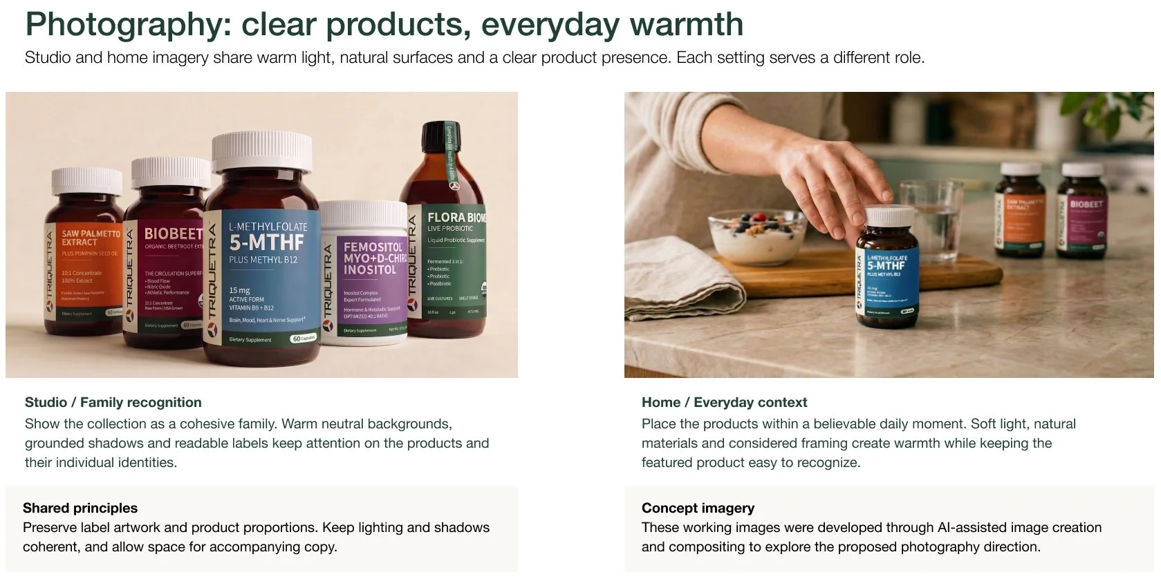
From the studio to the kitchen.
The studio lineup lets you read the five products as a family. The kitchen scene brings one of them into an ordinary morning. Warm light and natural surfaces connect the two settings, while each composition gives the product a different role.
06 / DIGITAL CONCEPT
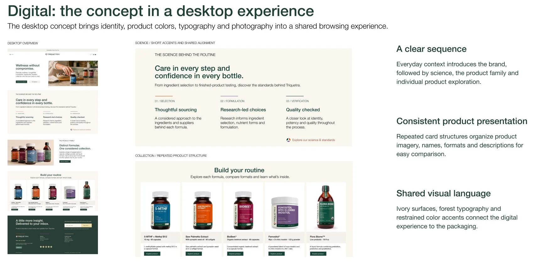
From shelf to screen.
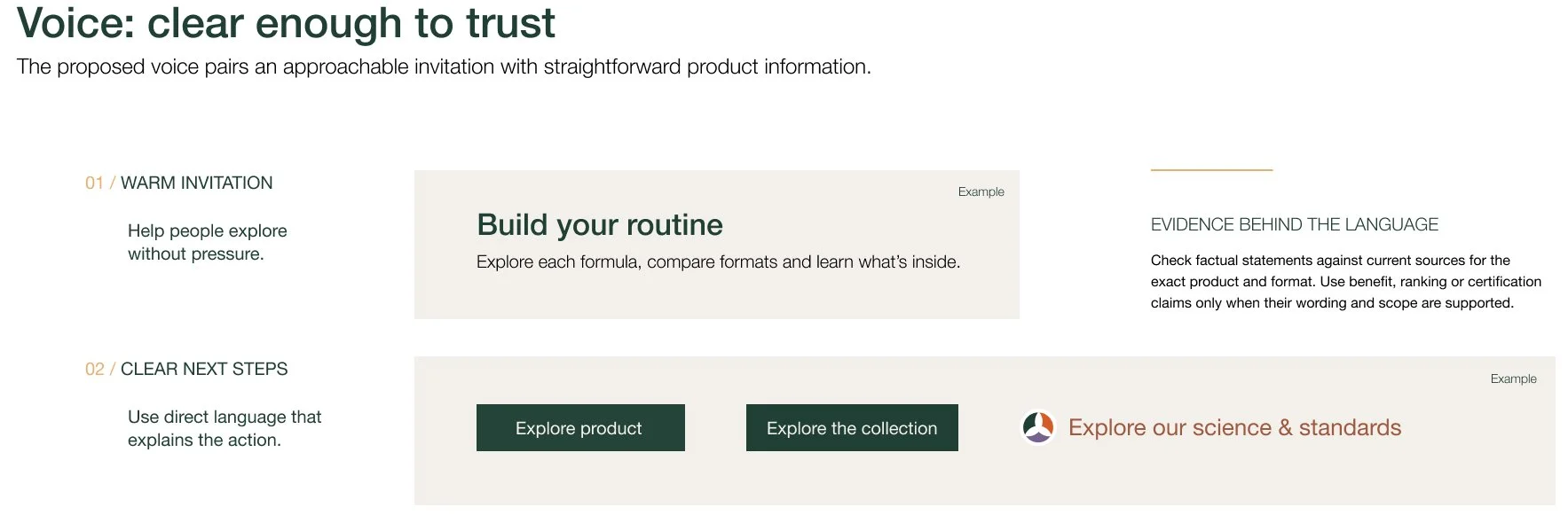
The desktop homepage opens with an everyday moment, introduces the brand’s approach to science and standards, then brings the collection into view. The packaging palette carries onto the page, and a repeated card layout gives product names, formats and next steps a consistent place.
CLOSING
The exploration began with a packaging question. It became a visual system that could hold five distinct products together and carry the same sense of family into imagery and digital design.
NATHAN SPOOR
CREATIVE DIRECTOR
