Curating a Brand Without Controlling the Art.
Society6 was built around thousands of independent creative voices. The opportunity wasn't to make them look the same. It was to create enough clarity around them that their differences became the brand.
Creative Direction · Curation · Artist Development · Product Innovation · Brand Experience
01 / LISTENING
The Community Was Already the Brand.
Society6 didn't need creativity imposed upon it. It already had more creativity than almost any conventional brand could manufacture.
The challenge was listening closely enough to understand what belonged together.
Working across a global community of independent artists meant developing a point of view without turning that point of view into a formula. Curation became a form of creative direction: identifying emerging voices, recognizing patterns across thousands of pieces of work, and creating opportunities for individual artists to become part of a larger cultural story.

The job wasn't to give thousands of artists one voice. It was to help thousands of voices feel like they belonged in the same conversation.
02 / CURATION
Taste as a System.
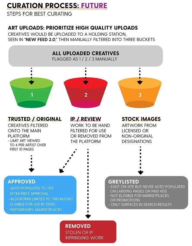
As Society6 grew, taste couldn't remain an instinct practiced by one person. It had to become something the team could discuss, defend, and develop together.
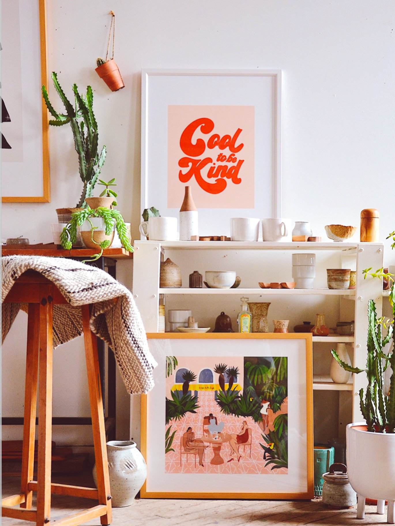
Curation considered visual quality alongside originality, medium, style, cultural relevance, diversity, product suitability, and the opportunity to introduce audiences to something unexpected.
The goal was to build a recognizable point of view while leaving enough room for discovery.
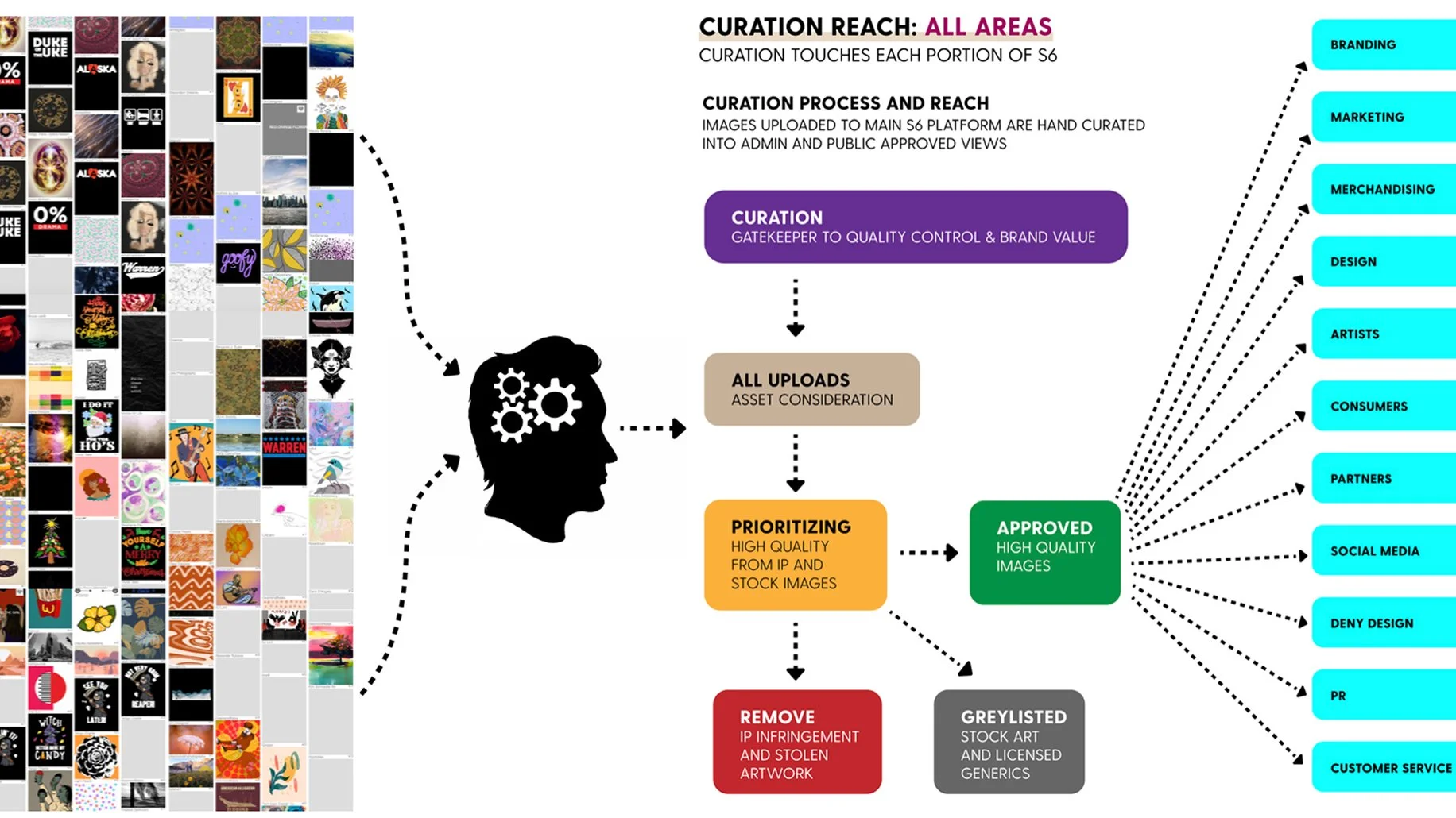
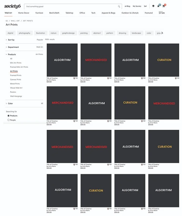
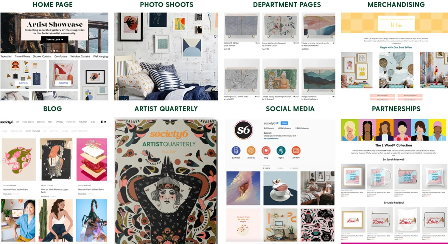
Taste becomes leadership when you can explain what you're seeing, and help someone else learn to see it too.
03 / STORYTELLING
Giving a Digital Community a Physical Voice.
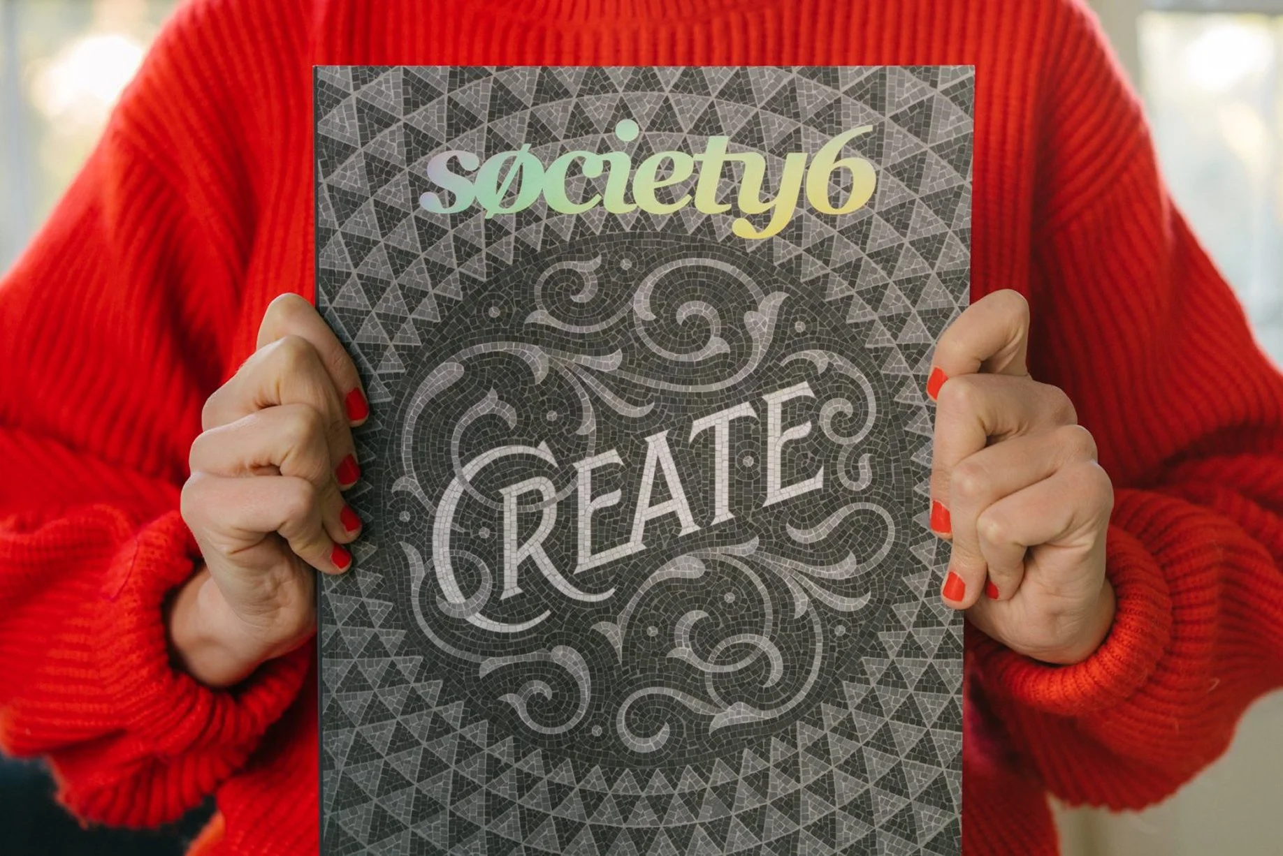
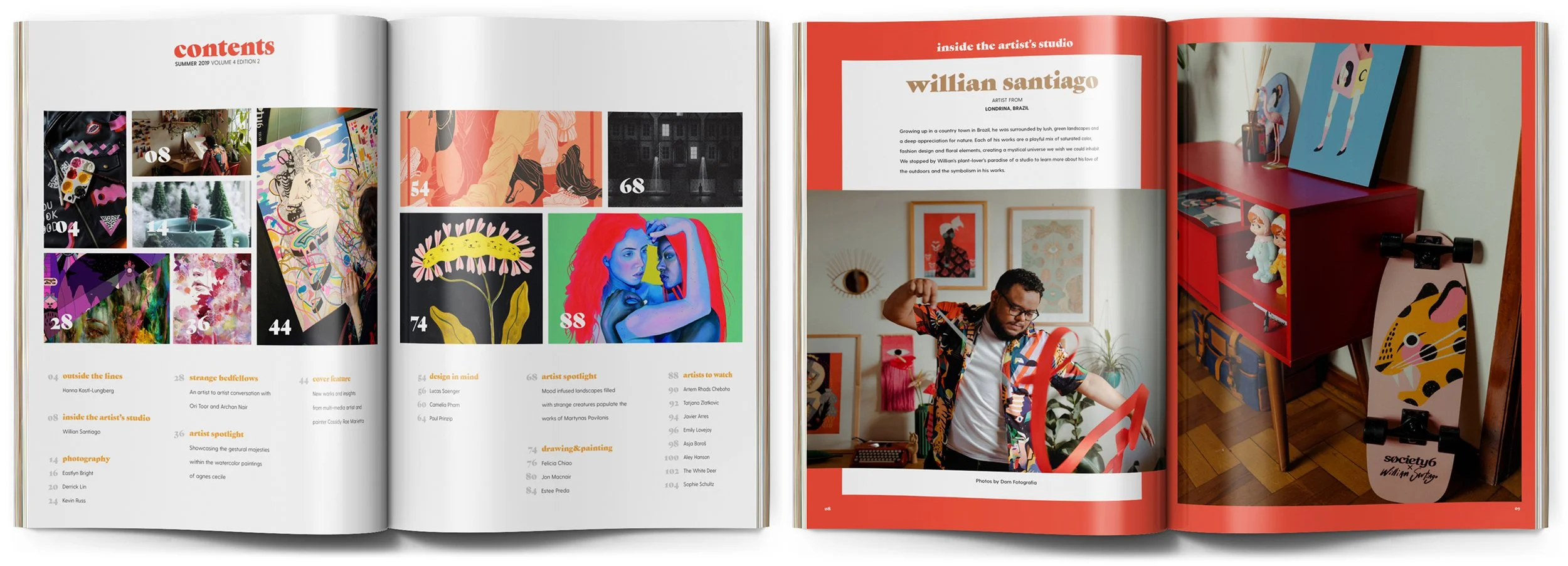
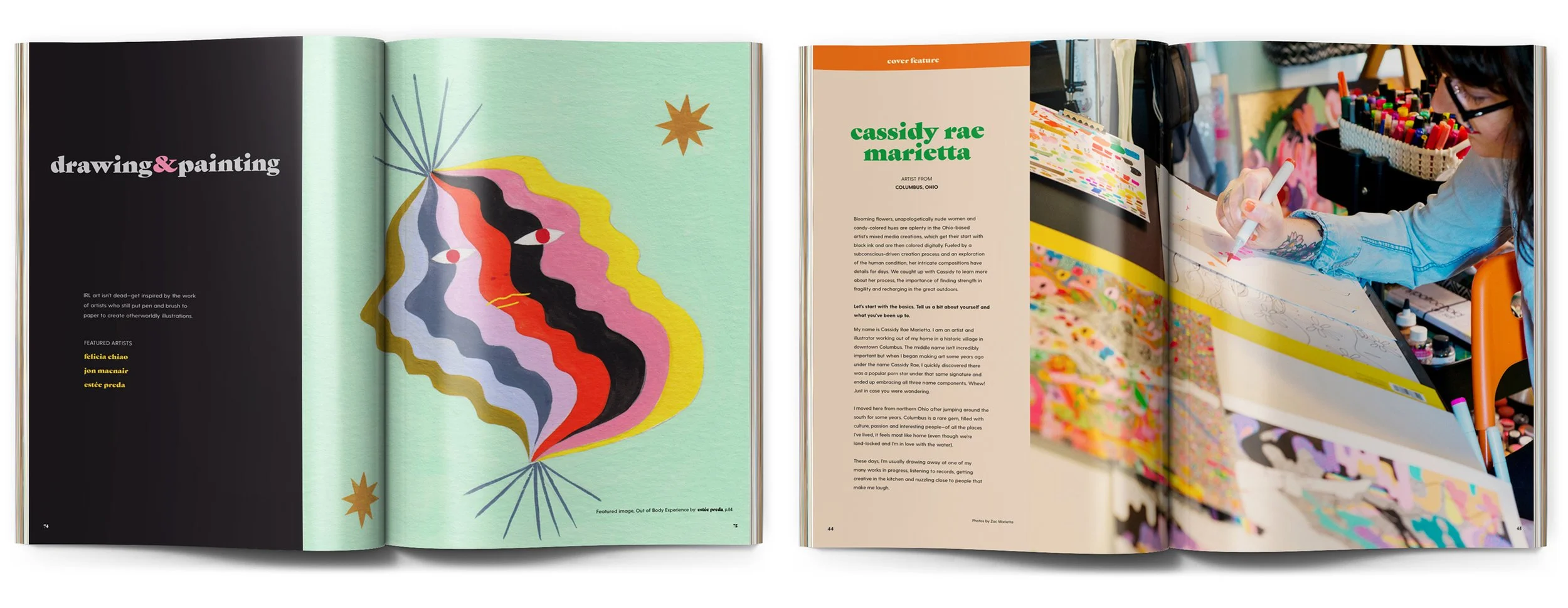
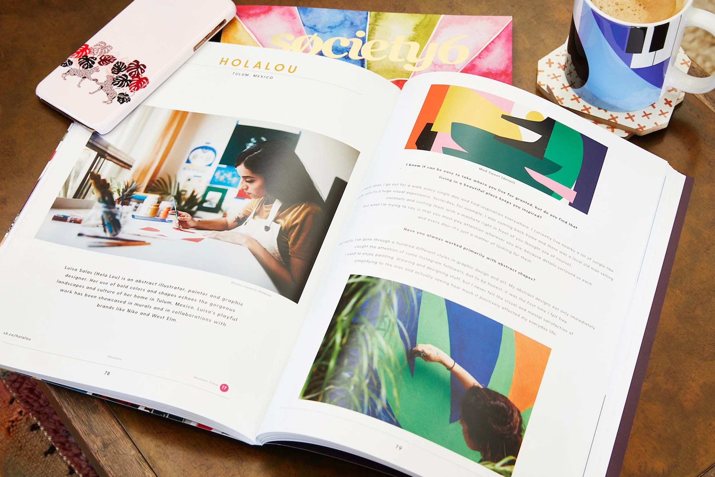
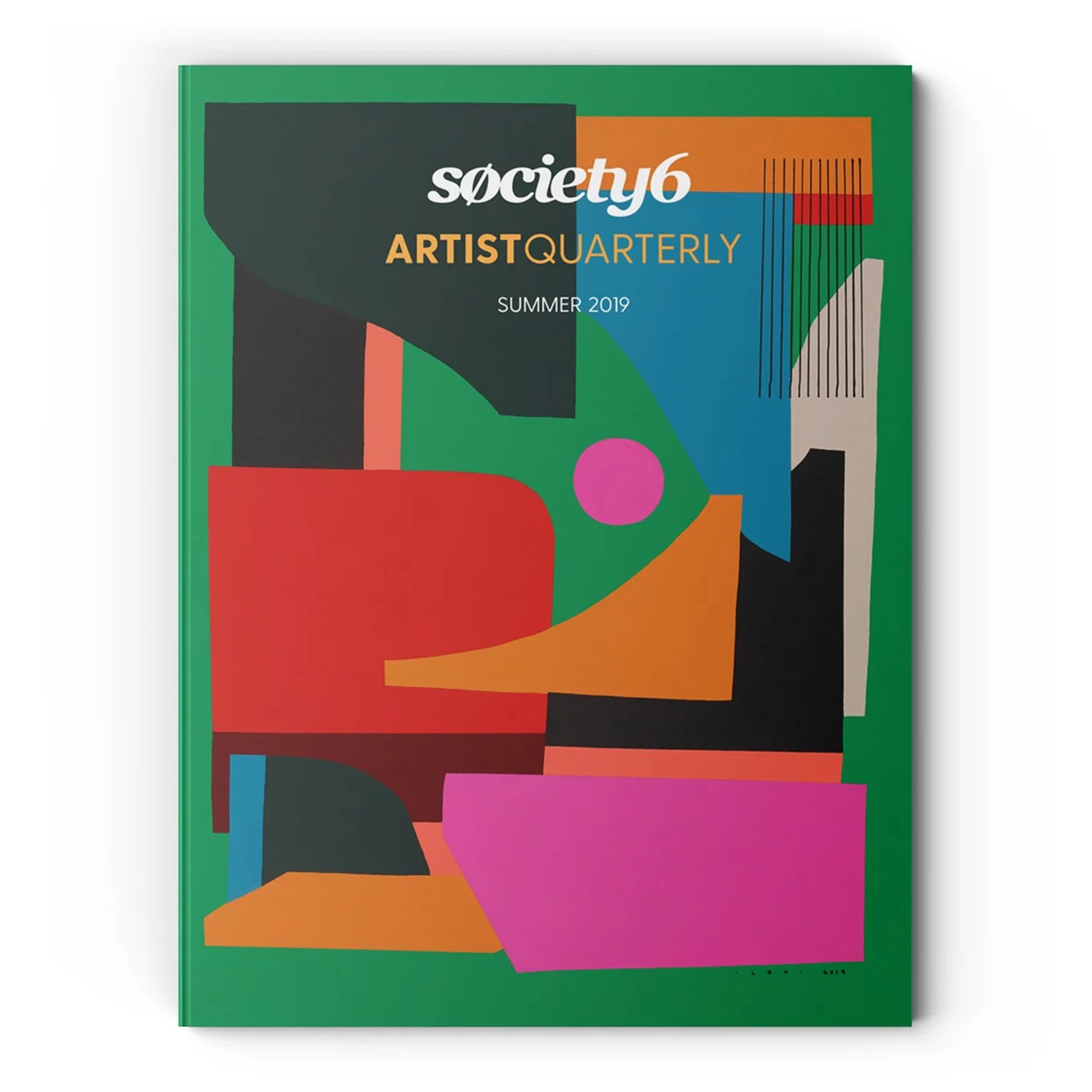
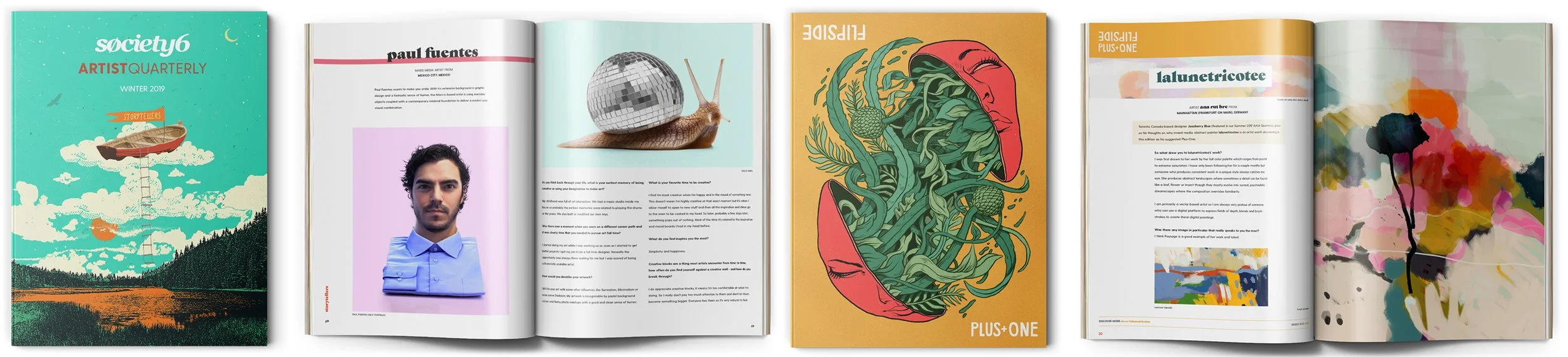
The Society6 Art Quarterly began as a limited-edition storytelling vehicle: a physical expression of a global digital art community.
I conceived and founded the publication during my first year with the team, directing its curation, artist selection, covers, layouts, editorial content, production, vendor relationships, press checks and final proofing.
The Quarterly gave the company something digital metrics couldn't: a tangible object capable of communicating the richness of the Society6 community to artists, collaborators, investors and leadership.
Each quarterly edition of 5,000 sold out, with participating artists receiving copies before release.
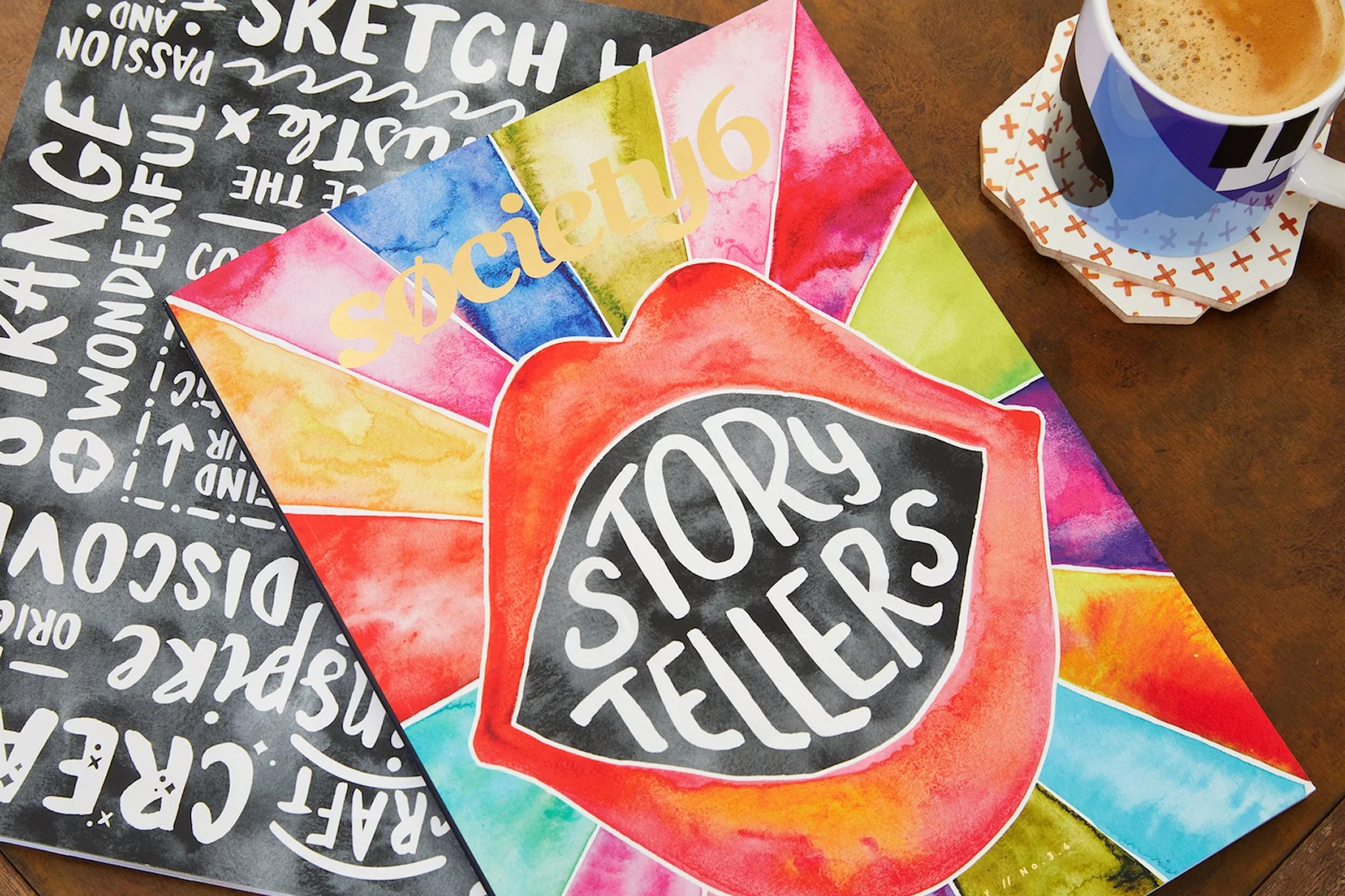
The more closely we listened to the art, the more obvious it became that the story was really about the person who made it.
From Art Quarterly to
ARTIST QUARTERLY.
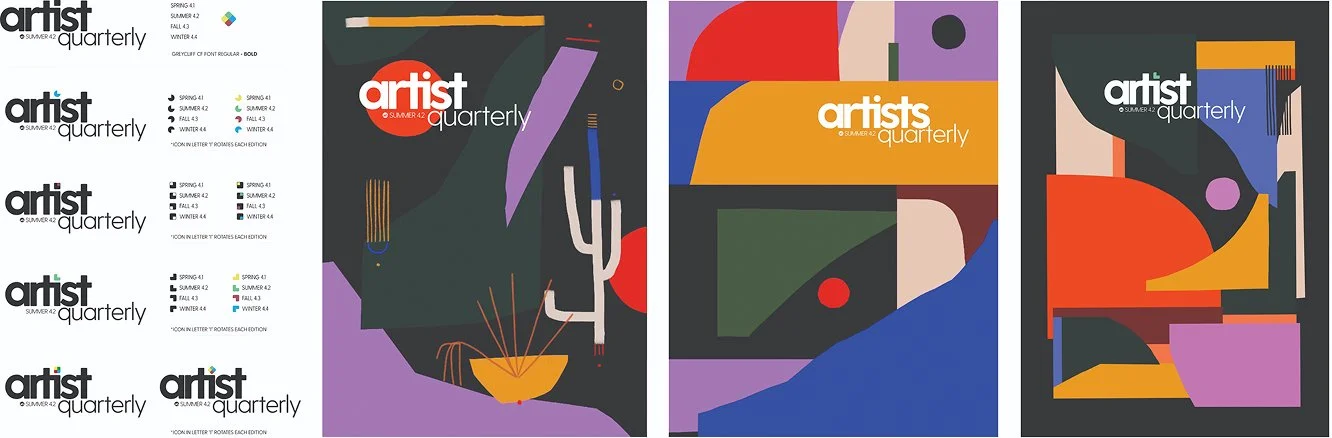
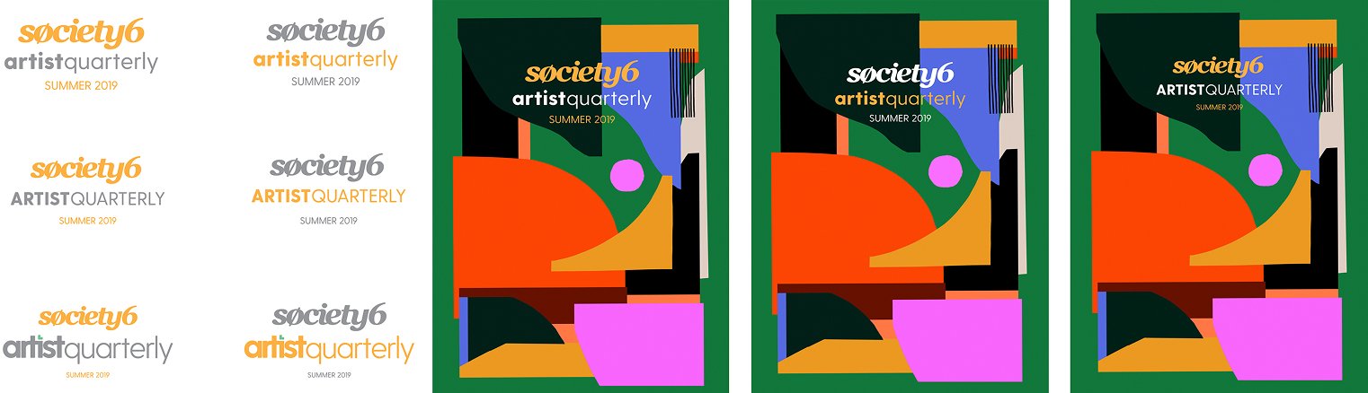
As the publication evolved, I proposed shifting its emphasis from Art Quarterly to Artist Quarterly.
It was a small change in language with a larger philosophical consequence:
Stories increasingly explored the people, environments and practices behind the finished work.
The artwork was no longer the protagonist.
The artist was.
04 / PARTICIPATION
The Flipside.
The next evolution challenged the structure of the publication itself.
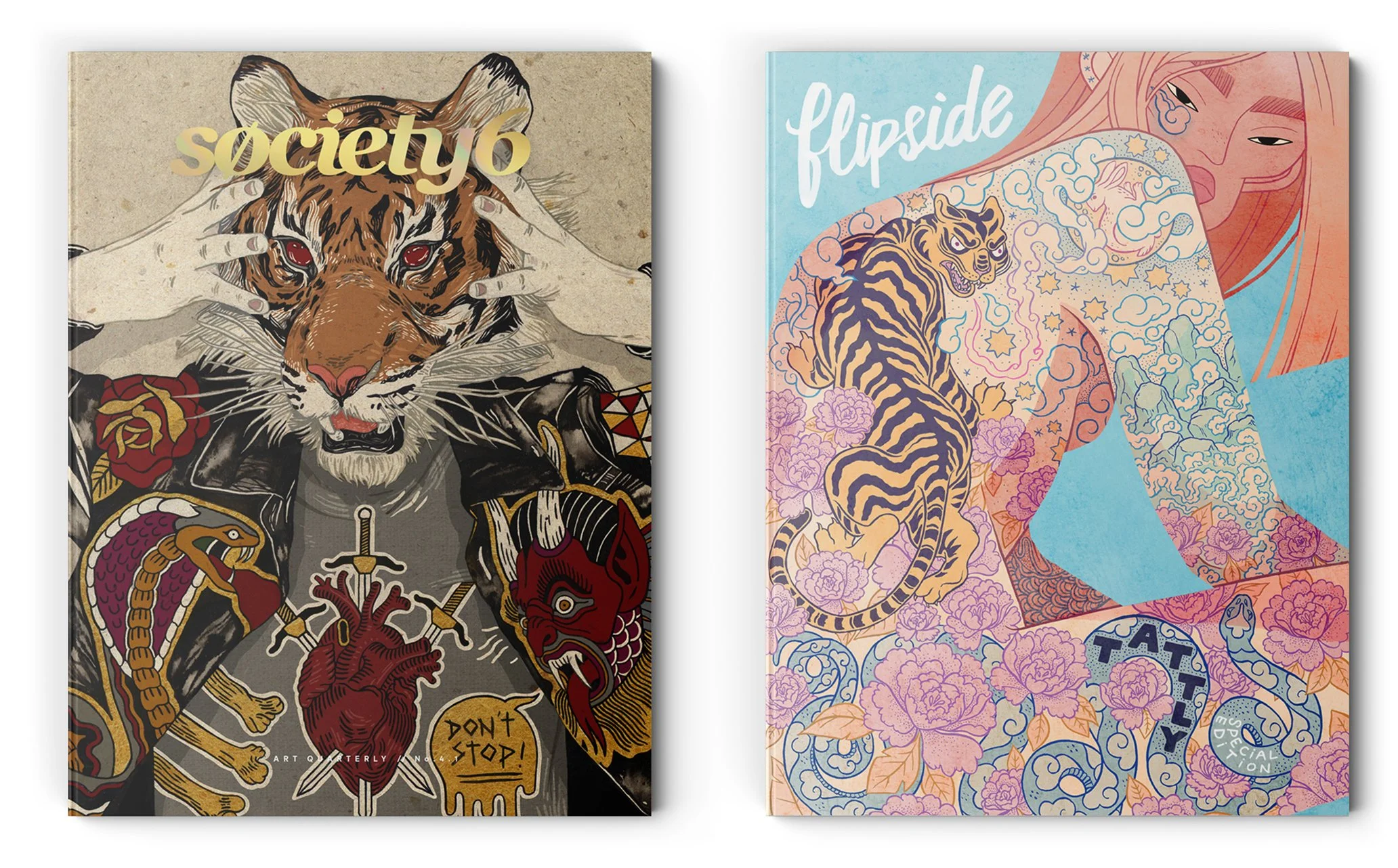
The Flipside Art Zine introduced a second cover on the reverse of the Quarterly. Readers could enter from either direction, creating a publication without a conventional front or back.
But the more important change was participation.
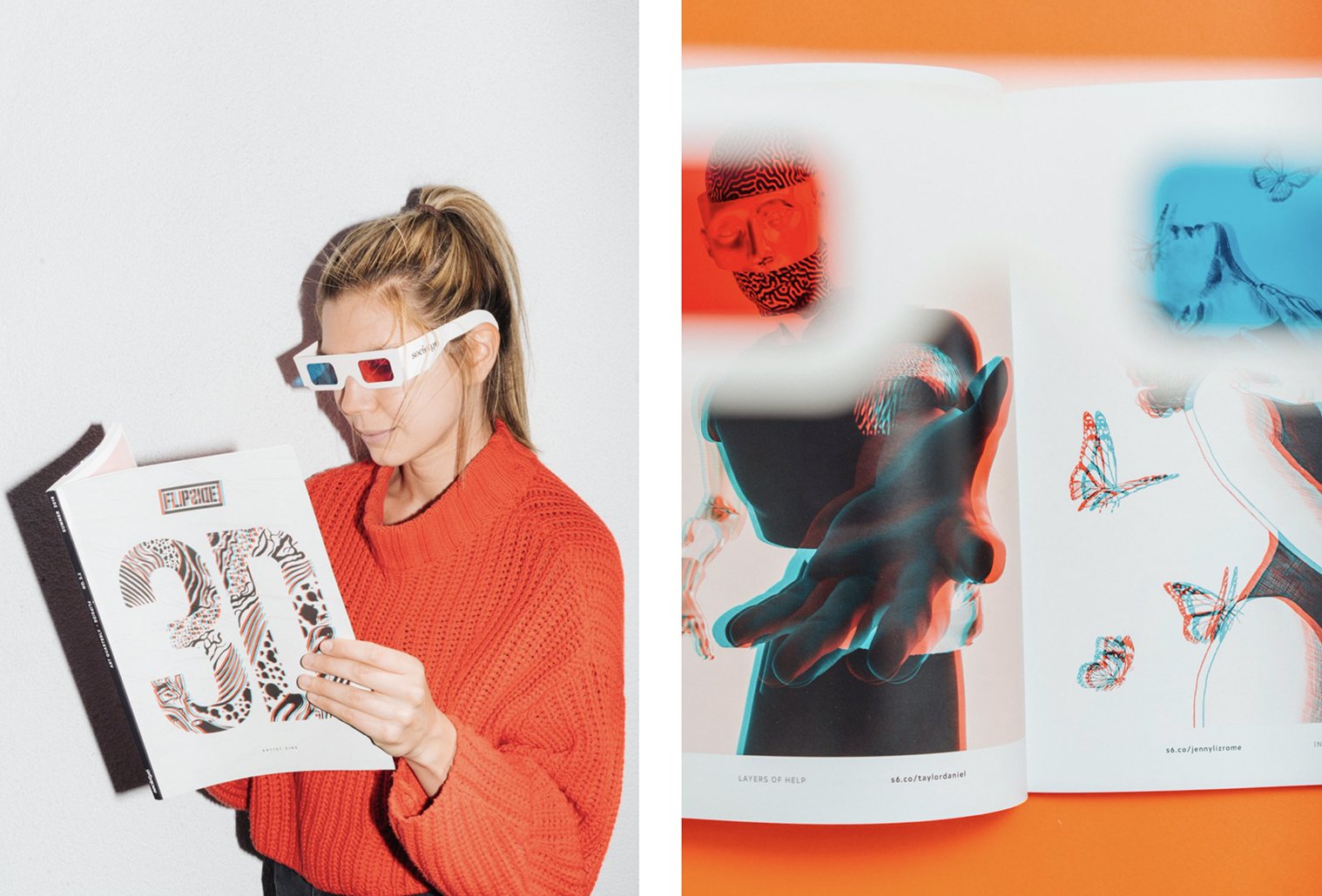
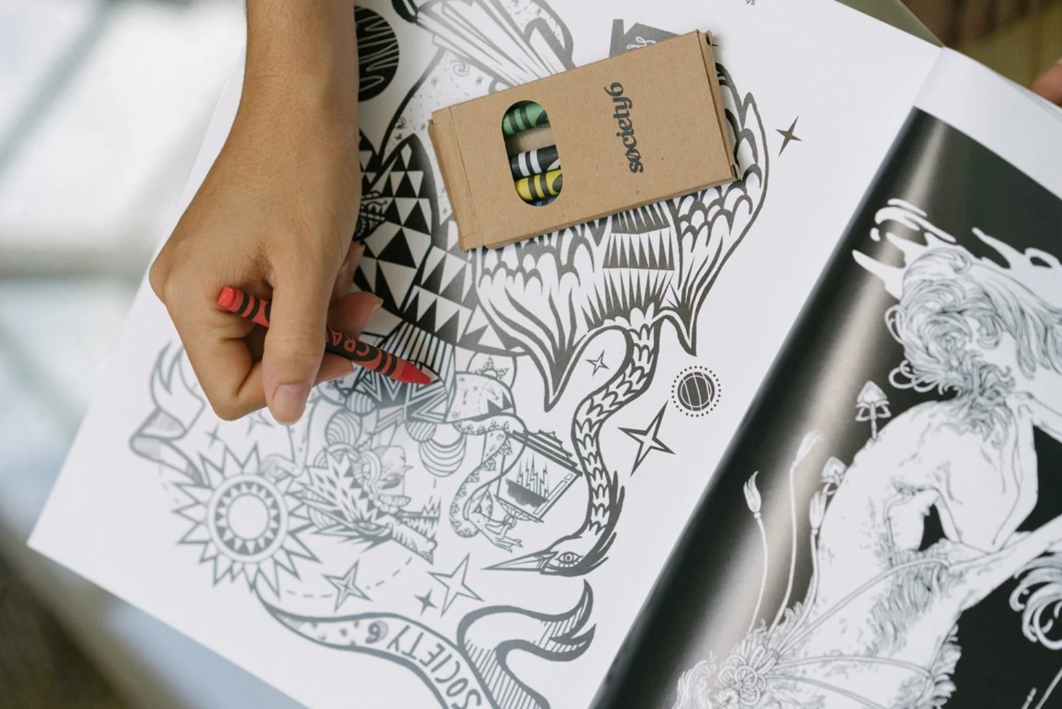
Artists responded to open calls and created new work around themes including Full Moon and Retro, while special editions experimented with formats such as classic red-and-blue 3D glasses and a coloring book with Society6-branded crayons. The publication moved beyond showcasing the community toward actively prompting new creativity within it.
The more closely we listened to the art, the more obvious it became that the story was really about the person who made it.
05 / FROM PLATFORM TO PRODUCT
Giving Digital Art a Physical Life.
The same curatorial thinking extended beyond editorial into product development. Limited-edition products became another way to connect artists, audiences, and the Society6 brand.
Each format required understanding what made the object itself interesting, then inviting artists to respond to it.
The product wasn't a blank surface for artwork.
The format itself became part of the creative brief.
Skate Decks
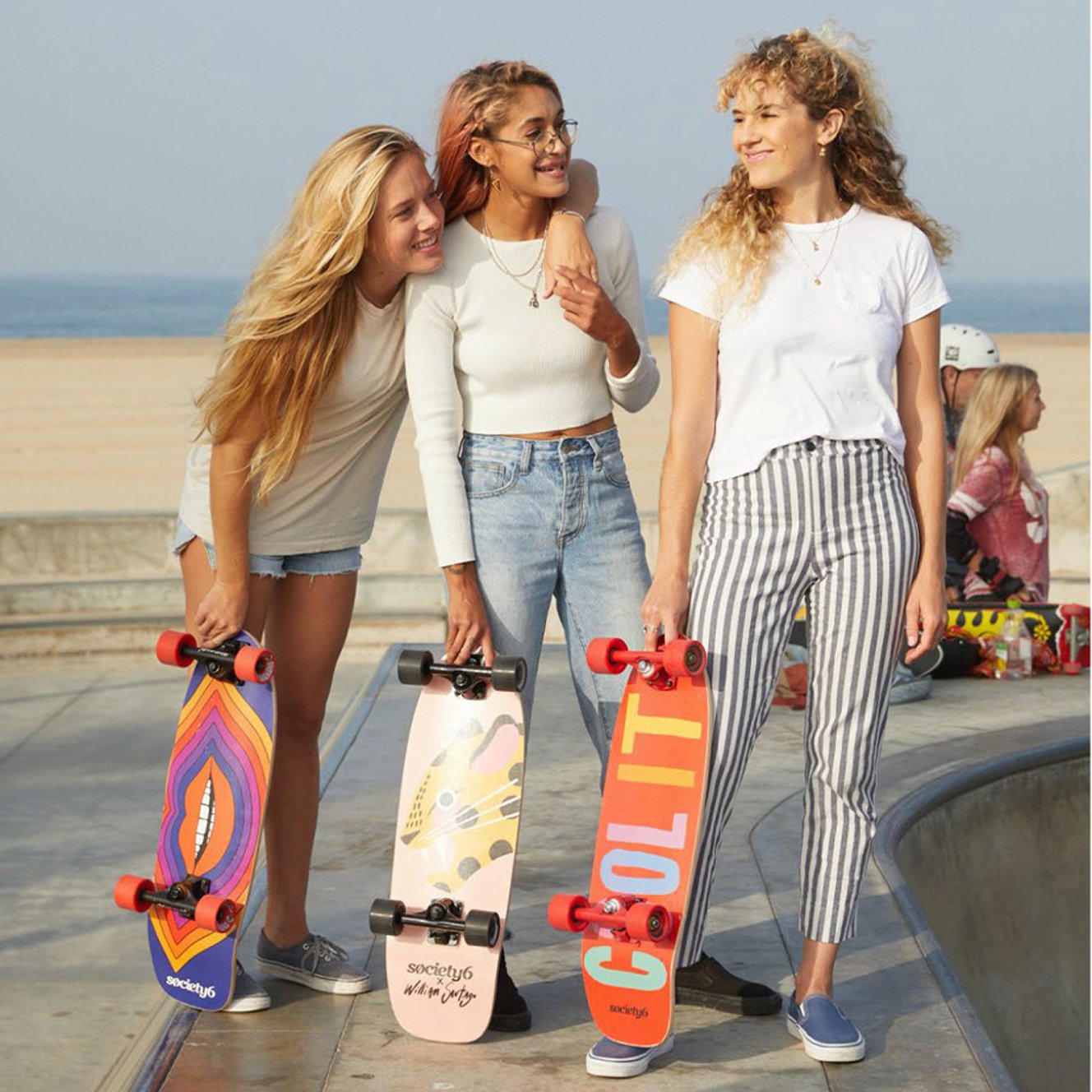
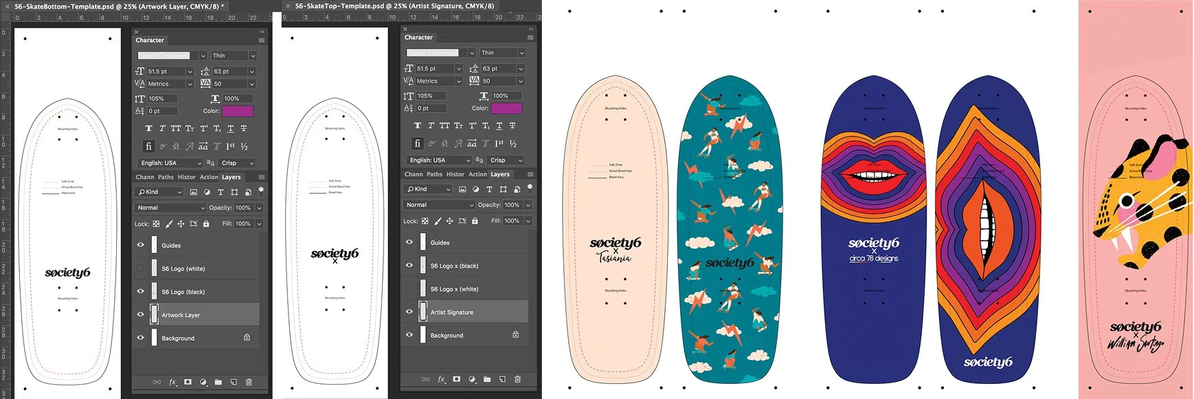
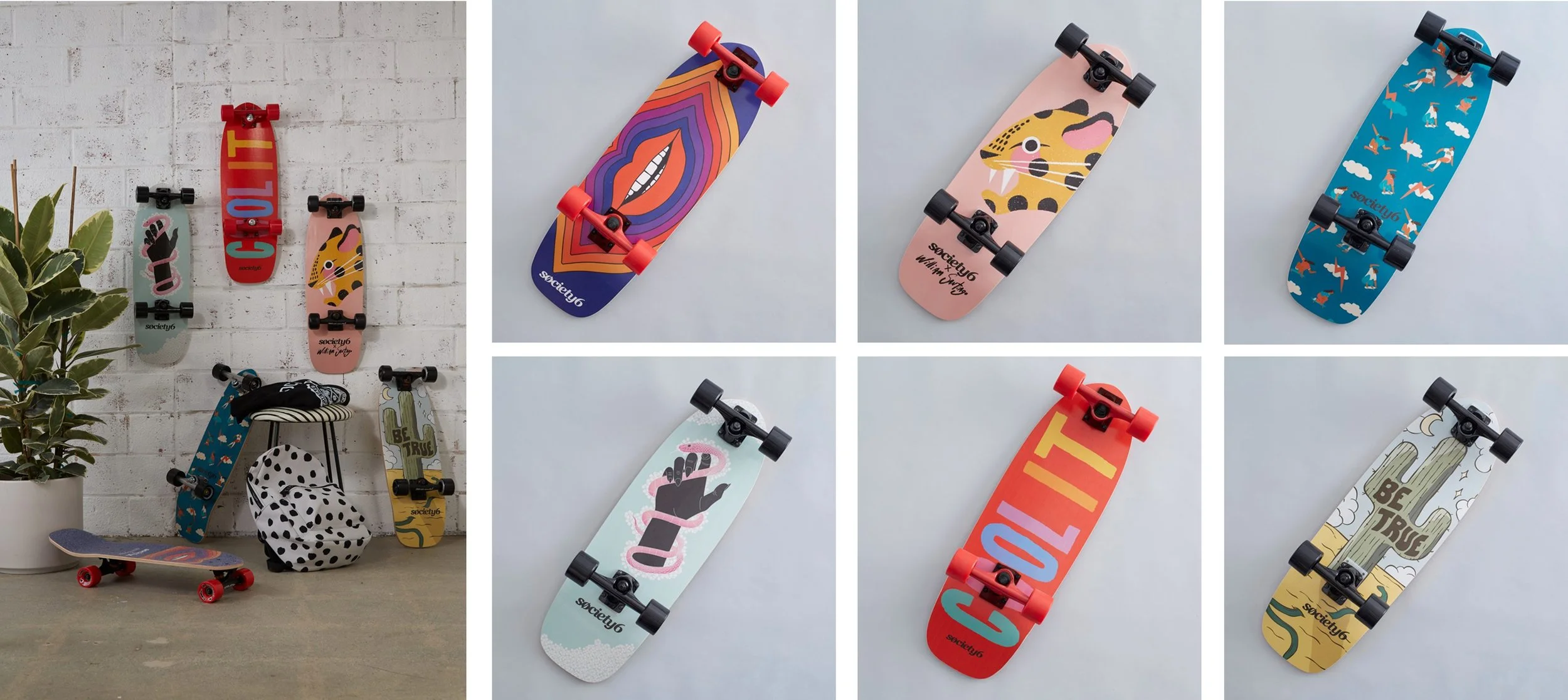
Artist curation, templates, vendor relationships, art direction, product testing, and proofing turned independent artwork into skatepark-quality decks, including complete setups and grip-tape options.
The products were physically tested in Venice, California before release.
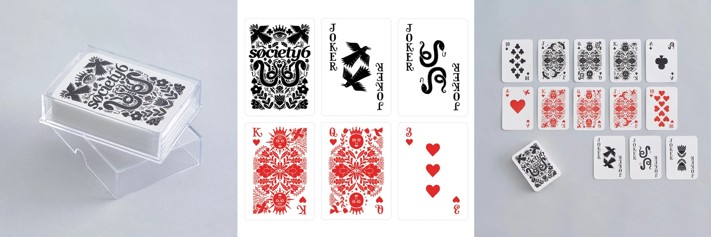
Playing Cards
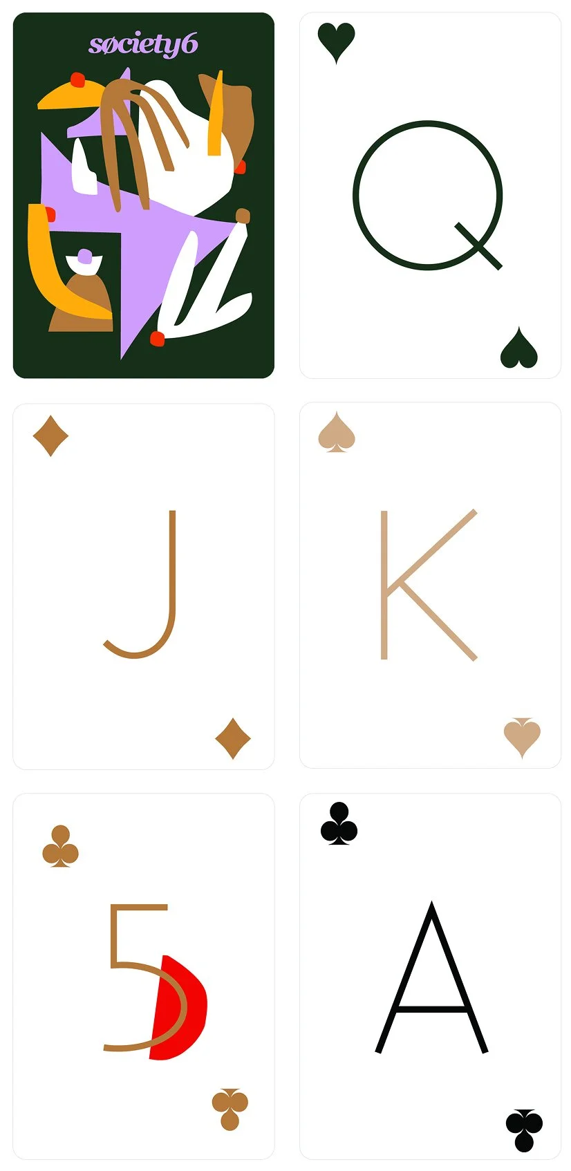
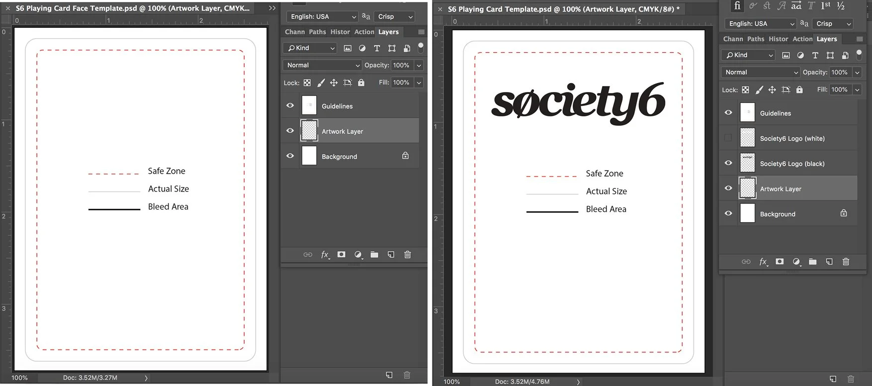
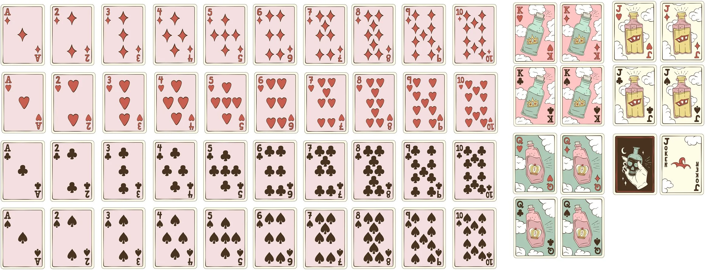
For the 2018 holiday season, selected artists were invited to treat an entire deck as a creative system—developing original artwork across suits, faces, and card backs.
The limited-edition decks sold out almost immediately.
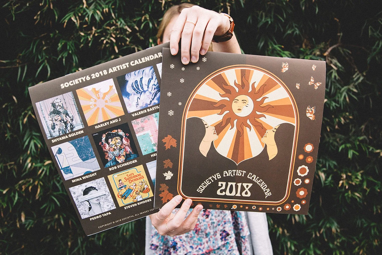
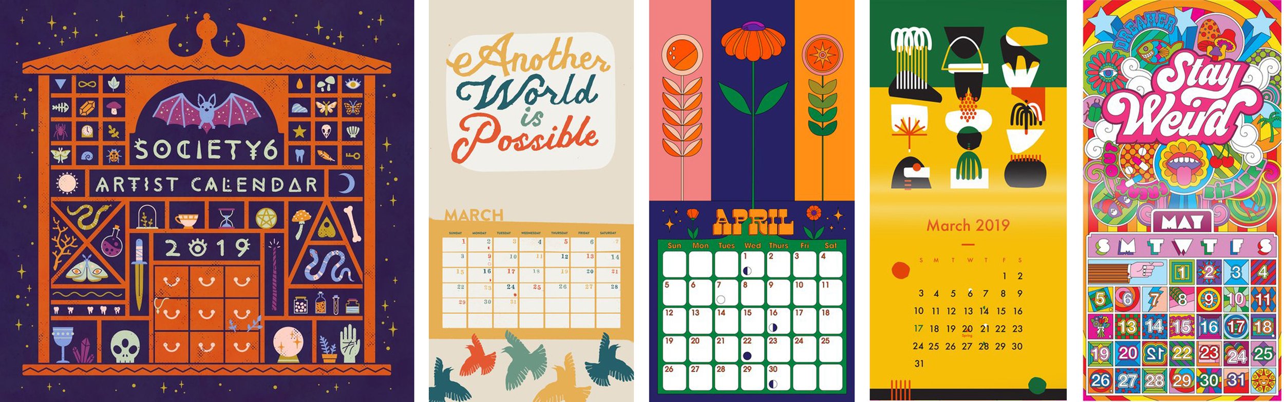
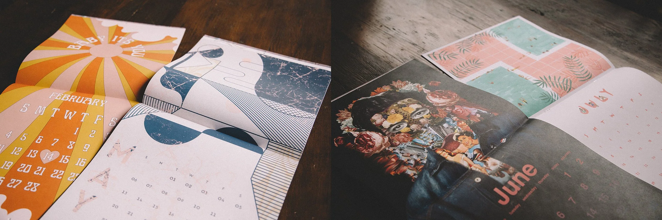
Artist Calendars
Artists created not only hero artwork but custom calendar grids and details including moon phases.
The program later expanded through successful concept pitches into Zodiac wall calendars and desktop editions, growing a single annual product into a broader family of collectible artist experiences.
The more closely we listened to the art, the more obvious it became that the story was really about the person who made it.
The more closely we listened to the art, the more obvious it became that the story was really about the person who made it.
The more closely we listened to the art, the more obvious it became that the story was really about the person who made it.
The opportunity kept expanding: from giving art a new surface to giving the community a new space.
06 / EXPERIENCE
Taking the Community Into the City.
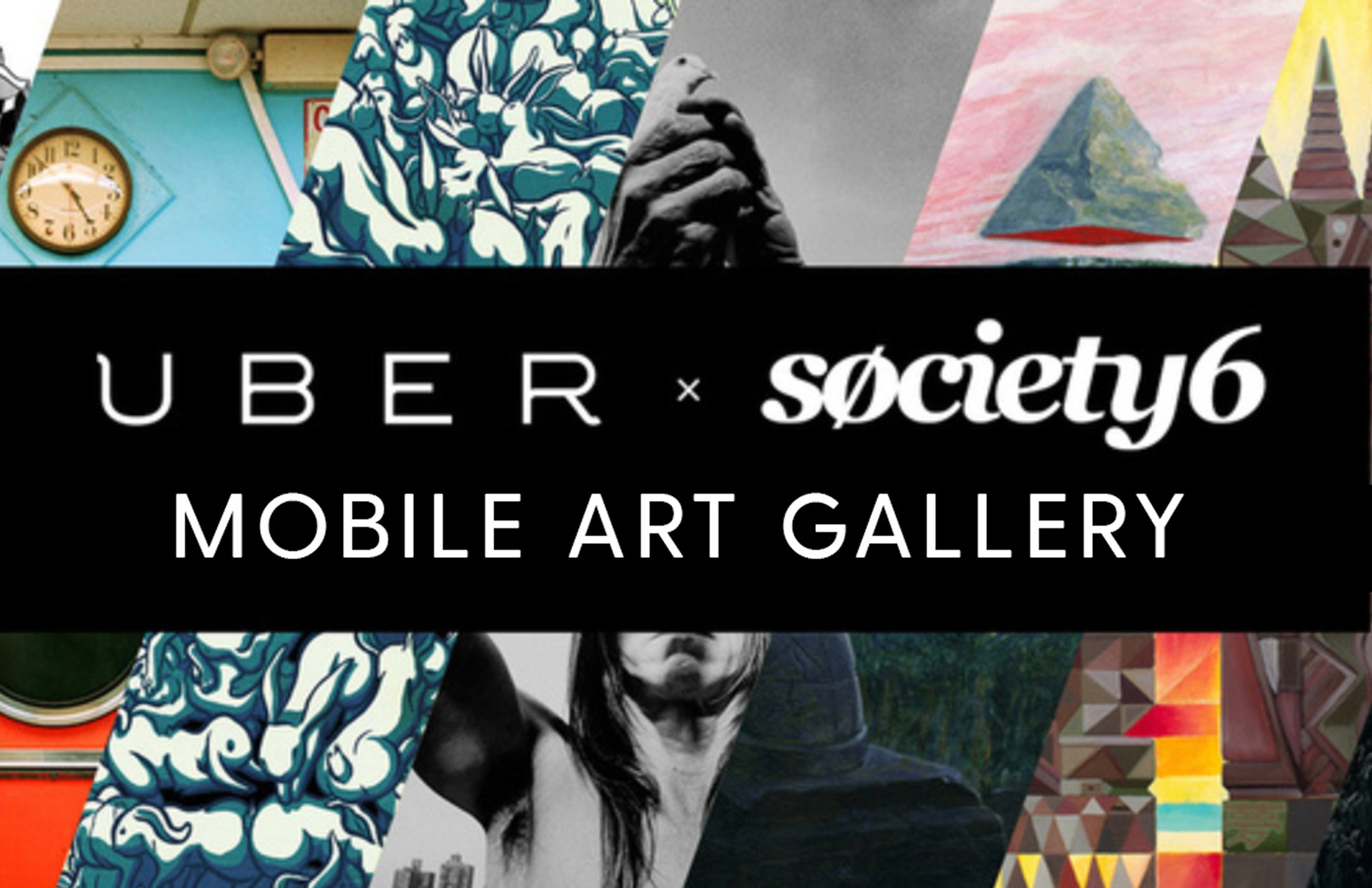
The Society6 × Uber Mobile Art Gallery brought the same idea into physical space.
Society6 and Uber transformed a 40-foot shipping container into a mobile gallery featuring work from Los Angeles-based Society6 artists alongside Uber driver-partner artists.
The gallery traveled through Los Angeles for a one-day experience, turning two digital communities into something people could physically enter.
My role encompassed curation, coordination, and art direction.
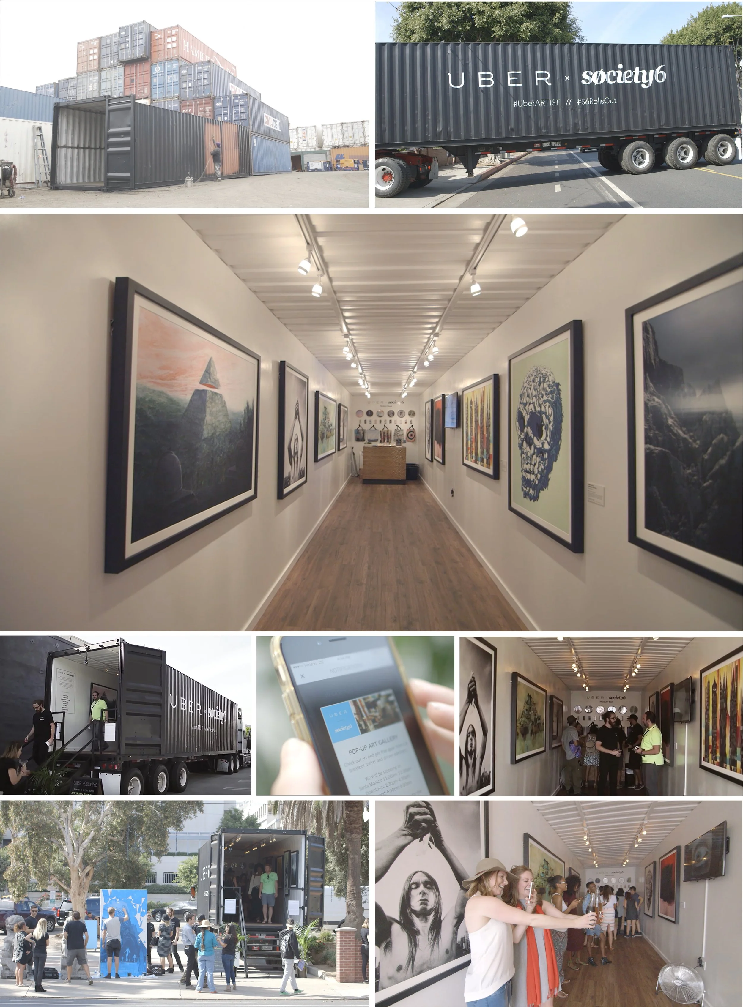
Sometimes the most effective way to make a digital community feel real is to give people somewhere to stand inside it.
07 / LEADERSHIP
Creating the Conditions for Other People to Make Great Work.
Across publications, products, collaborations, and experiences, the common thread wasn't a particular aesthetic.
It was a way of working.
Listen first.
Recognize what is distinctive.
Create a framework strong enough to provide direction but open enough to invite interpretation.
Give artists and designers ownership.
Protect quality without protecting ego.
And understand when creative leadership should become almost invisible so someone else's work can become visible.
Creative leadership isn't always making the work. Sometimes it's creating the conditions in which remarkable work can appear.
CLOSING
A Brand Built From Many Voices.
Society6 taught me that consistency doesn't have to mean sameness.
A brand can be recognizable because of the quality of its judgment rather than the repetition of a visual formula. Across editorial, product, community, and experiential work, the objective remained remarkably consistent:
Listen closely enough to recognize what deserves attention.
Build the structure that allows it to be seen.
Then know when to get out of the way.
NATHAN SPOOR
CREATIVE DIRECTOR