
A growing brand needed clarity before it could scale.
Growth had outpaced the brand’s visual system. My role was to listen, find what needed to become clearer, and build a design language capable of growing with the business.
Creative Direction · Brand Strategy · Identity · Packaging · eCommerce · Design Systems


01 / LISTENING
The beginning.
Dr. Frederick’s Original had strong products and a loyal customer base, but growth had outpaced the brand around them. Packaging, messaging, and visual expression had evolved independently, making the experience increasingly difficult to recognize and scale.
Before designing anything new, we needed to understand what should remain—and what needed to become clearer.

Clarity wasn’t just about making things look better.
It was about building a foundation for everything that came next.
02 / IDENTITY
Finding the voice.
The original identity carried recognition, but it no longer reflected the confidence of the growing brand. Rather than abandon what customers already knew, we looked for the elements worth carrying forward.
The wordmark became simpler, stronger, and easier to recognize across packaging and digital environments. The existing sparkle evolved from decoration into a meaningful brand asset—a small expression of optimism, improvement, and the better everyday experience the products promised.

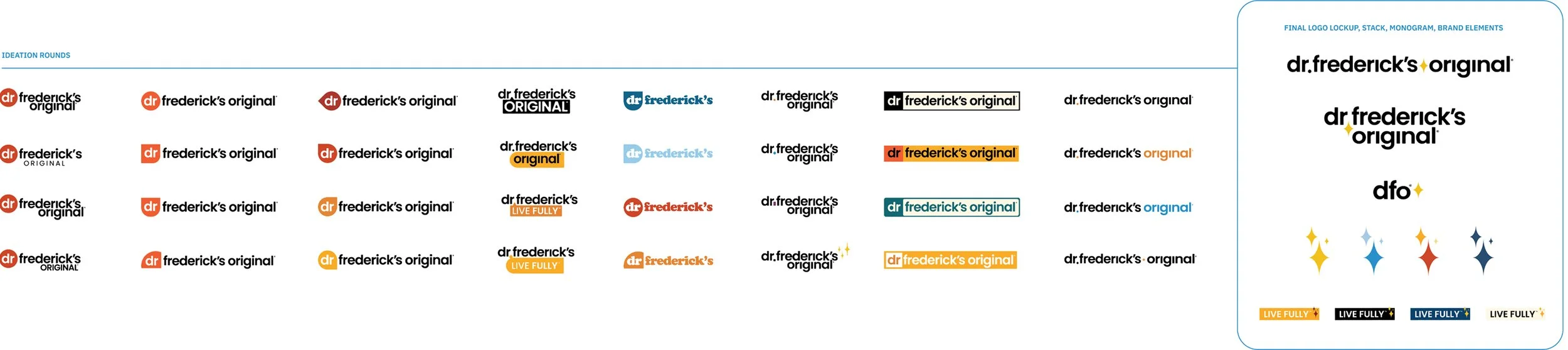
Evolution over reinvention.
Each round tested what the identity could lose, what it needed to keep, and what could become distinctly ours.
03 / SYSTEM
Designing for scale.
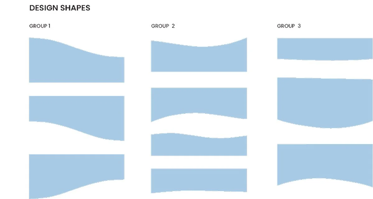
Color, Type & Form
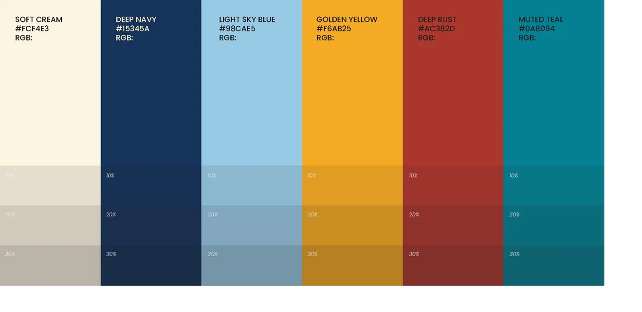
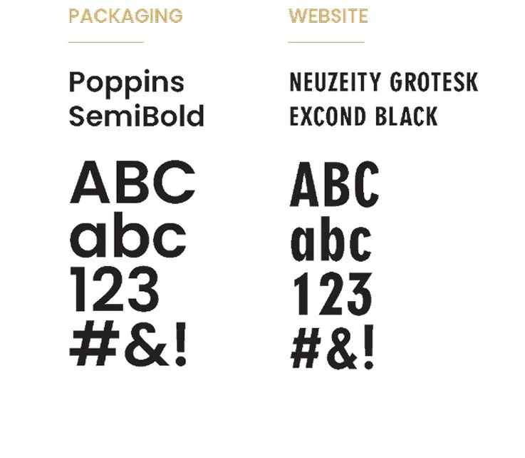
The identity needed enough structure to remain recognizable and enough flexibility to support a growing product line. Color, typography, and graphic forms were developed as a shared visual language—calm, optimistic, accessible, and easy to apply.
The goal wasn't novelty. It was creating a system people could use confidently and consistently across packaging, digital, social, and internal communication.
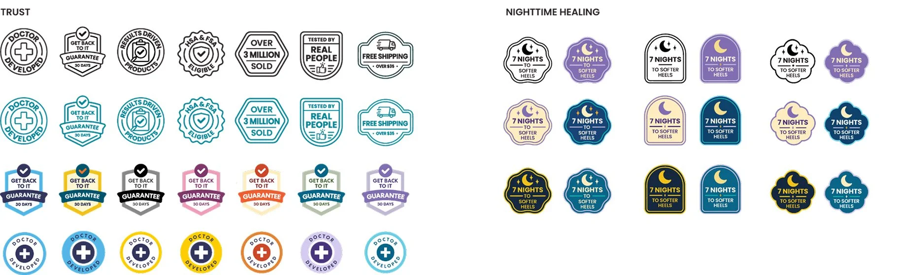
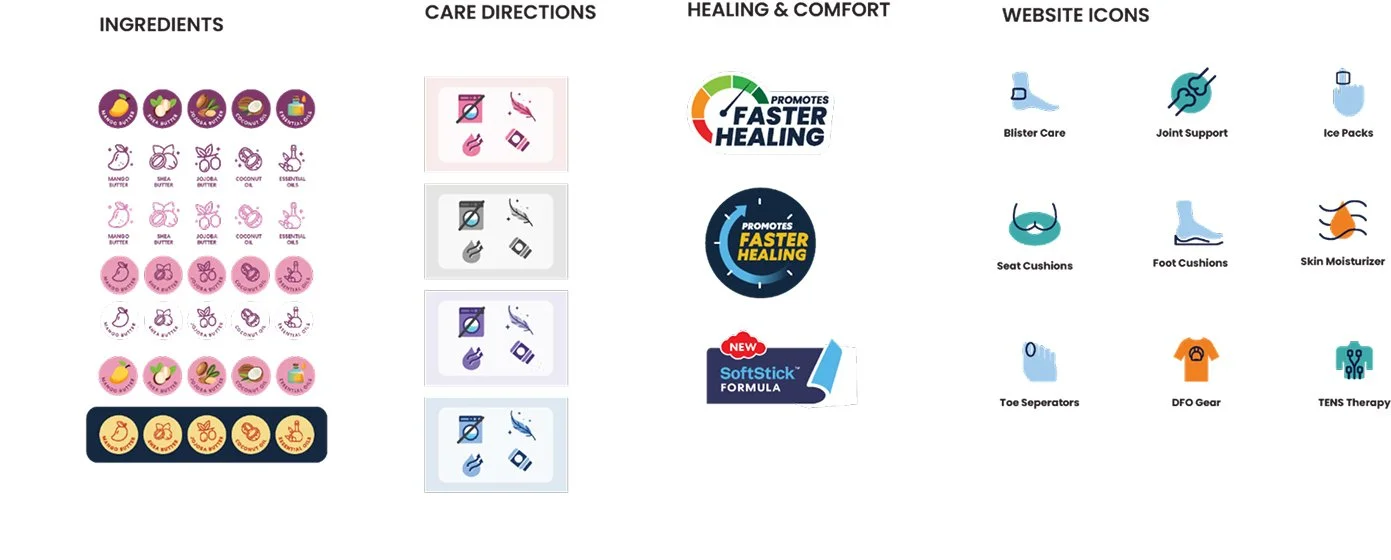
Brand Iconography
Icons extended the system into information. A simple visual vocabulary made product benefits easier to understand while maintaining a recognizable voice across an expanding range of applications.
Brand Illustration System
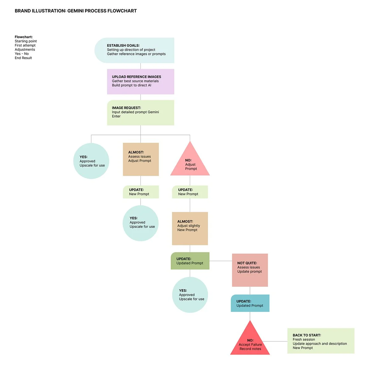
Illustration began as a handcrafted visual language and evolved into a repeatable system. Character sheets, style rules, and AI-assisted workflows helped preserve the warmth of the original artwork while making the approach practical across print, web, email, and internal communications.
The technology changed the speed. The system protected the voice.

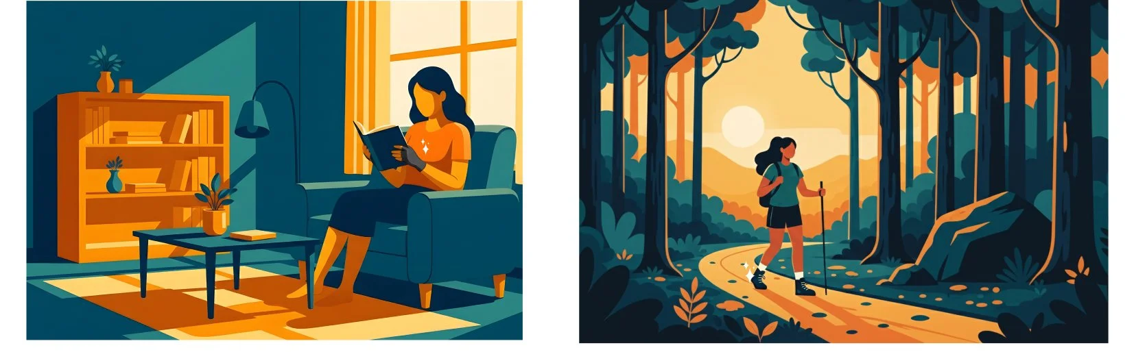


Once the system became clear, every image had a larger job: make the usefulness of the product feel human.
04 / SCALE
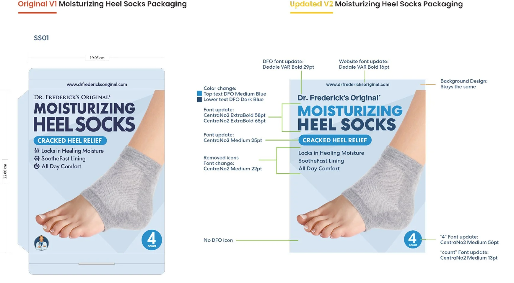
Packaging as a system.
Packaging became the proving ground for the new brand.
Each generation responded to what we learned from the one before it—improving hierarchy, recognition, product communication, and consistency while accommodating the realities of a rapidly expanding catalog.
Through testing, polling, team review, and continuous refinement, individual packages became a system capable of supporting the business rather than slowing it down.
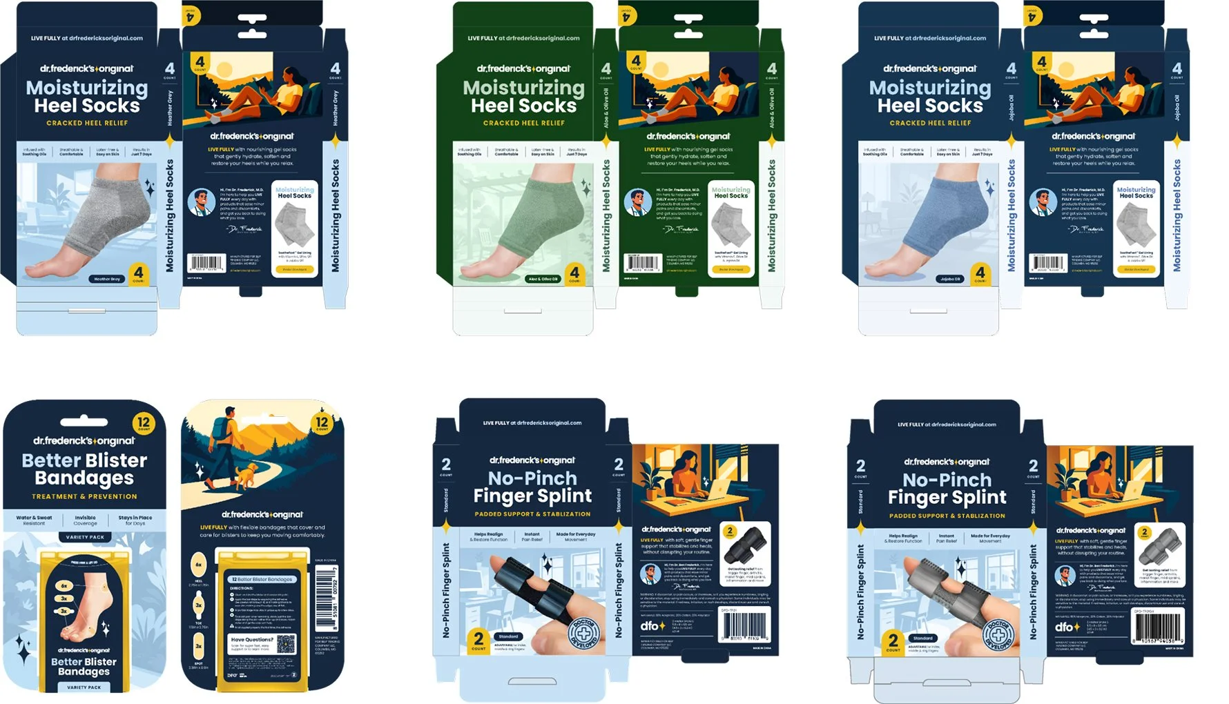
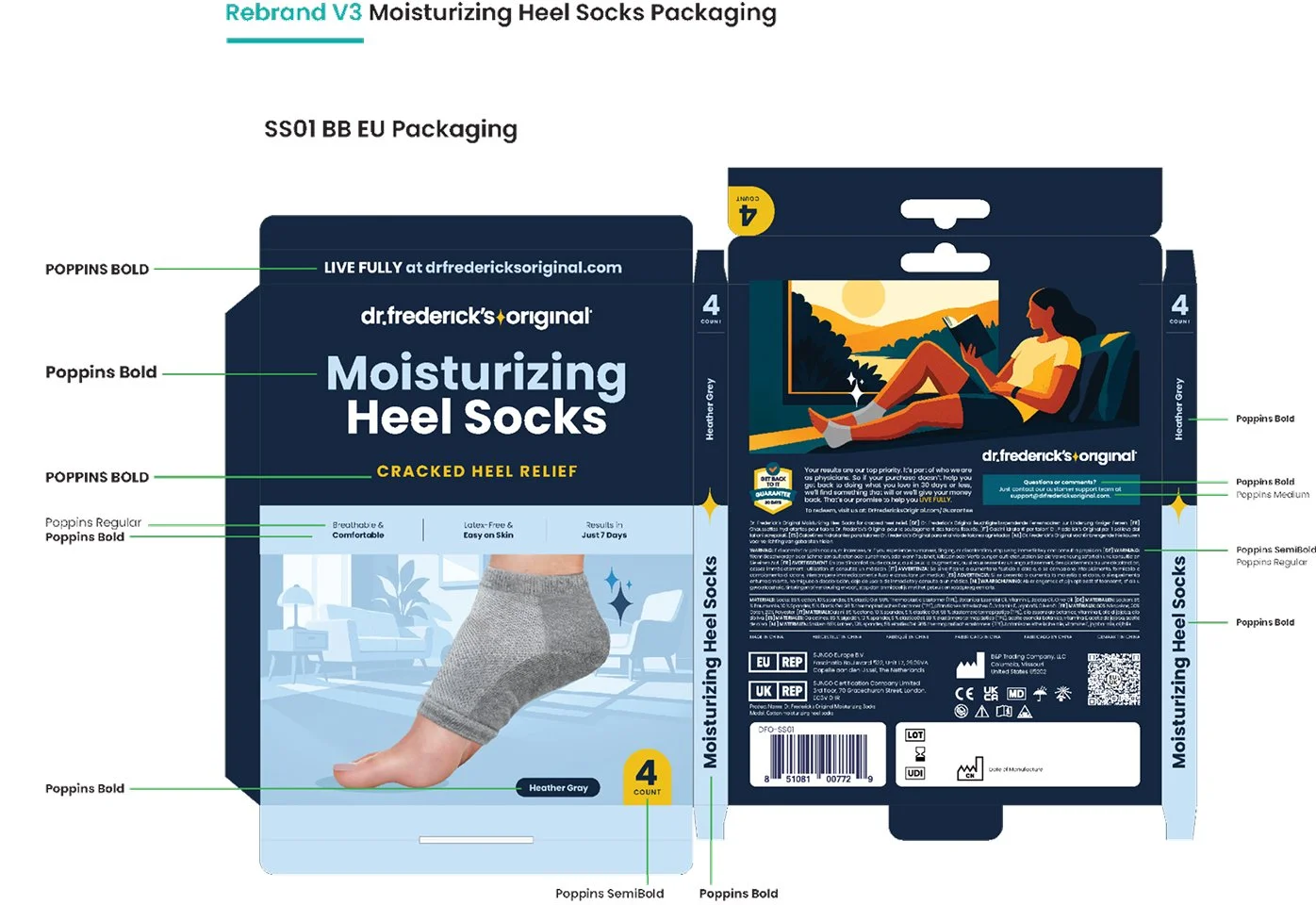
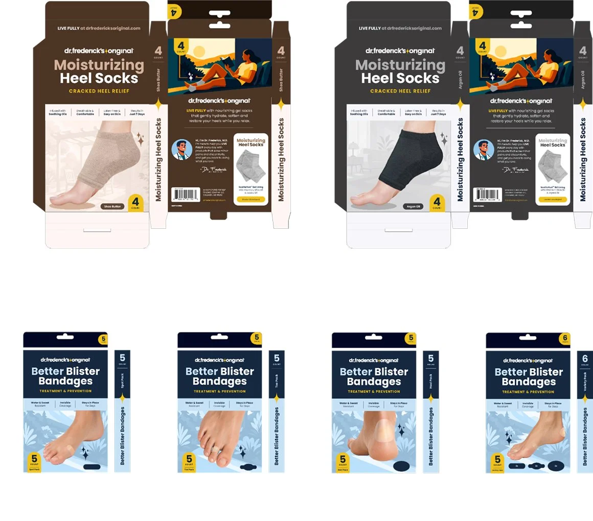
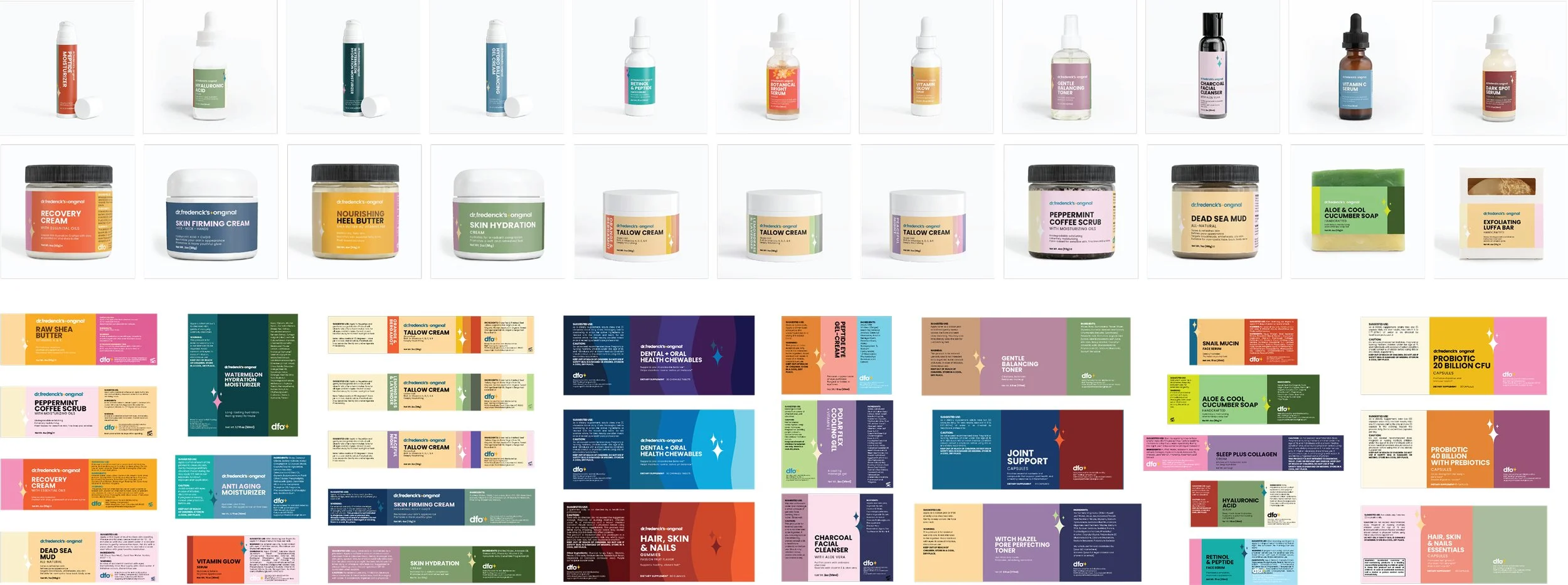
The measure of the system wasn't how consistent it looked.
It was how confidently the brand could move forward.
05 / EXPRESSION
Photography, Digital, Amazon.
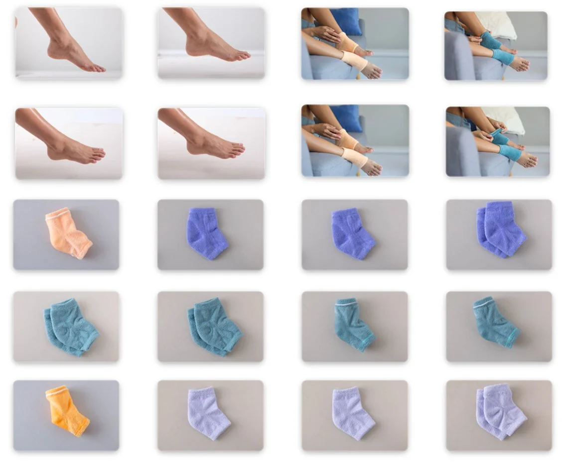
Original photography became essential to building trust. Real products, real bodies, and thoughtful art direction helped distinguish the brand from increasingly interchangeable marketplace imagery.
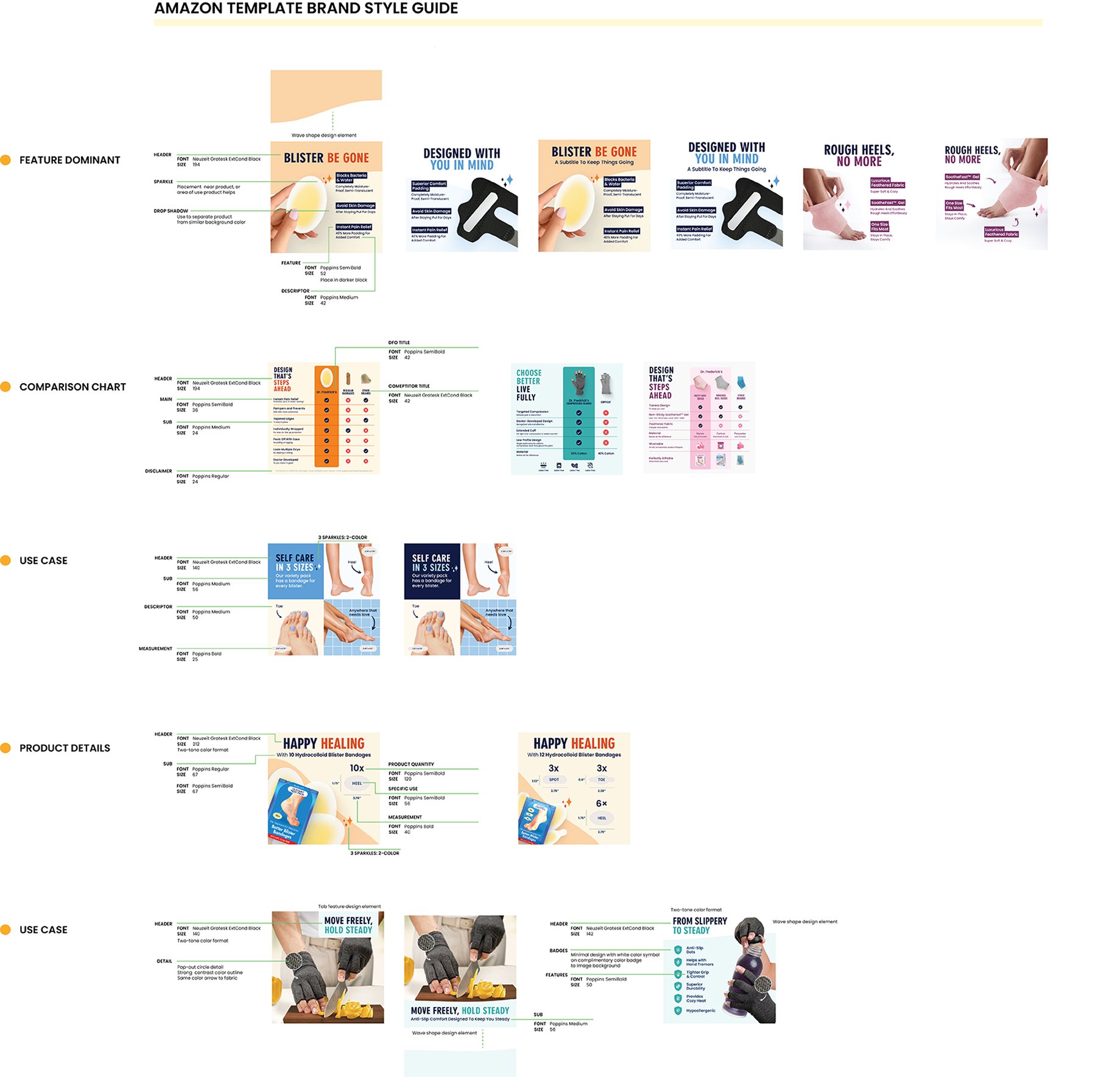
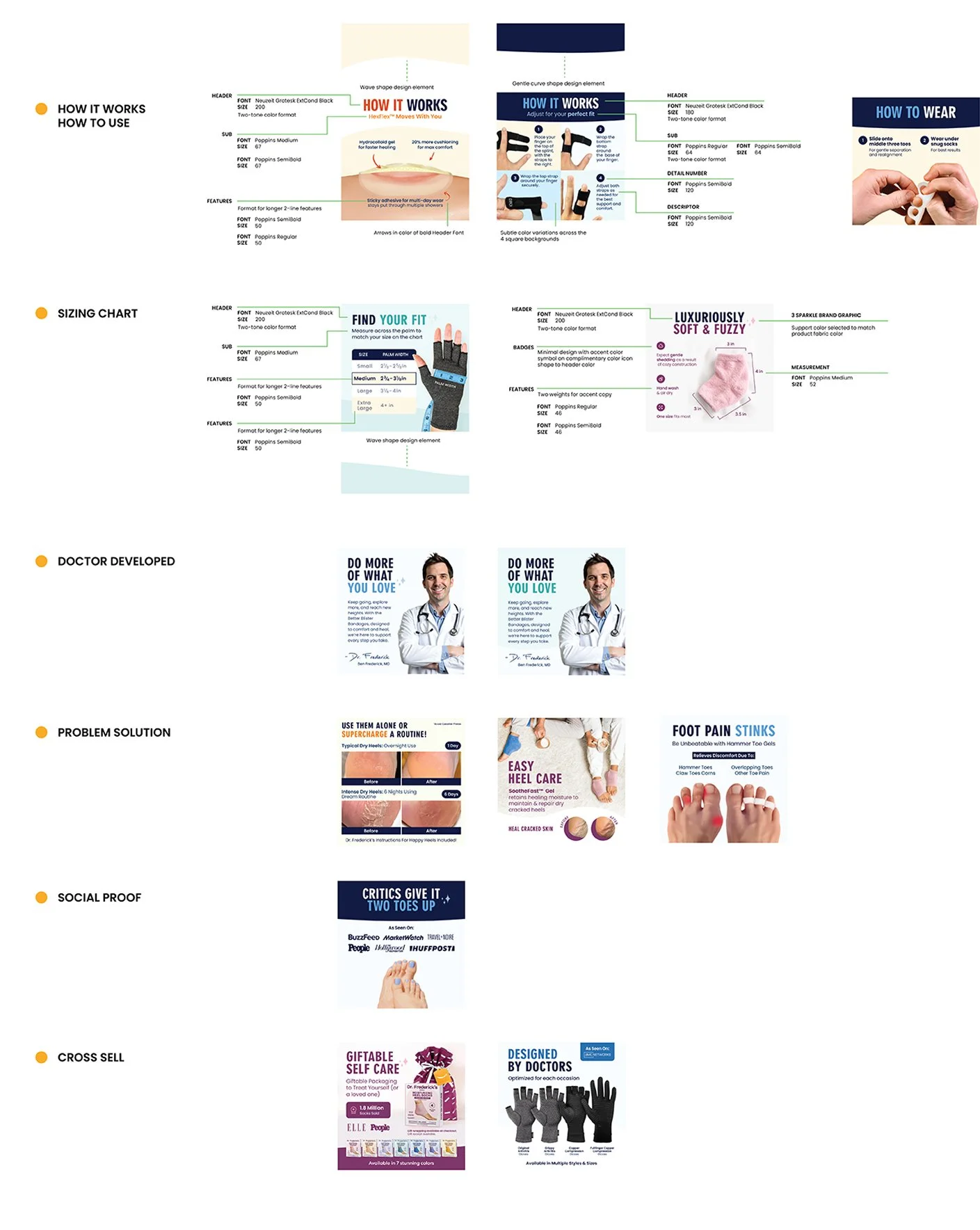
That foundation carried into Amazon, where photography, hierarchy, product education, and visual hooks were shaped into a consistent journey from first impression through consideration.

06 / ENABLEMENT
Teams, Workflows, What Changed.
A design system only becomes a brand when the people using it understand why it exists. The work wasn't finished when the design was approved. It was finished when the team could make good decisions without me.
That meant bringing people into the process—sharing the reasoning behind decisions, building tools that made good choices easier, and creating enough structure for individuals to work confidently within the brand.
As ownership spread across the team, consistency stopped depending on oversight. It became part of how we worked.
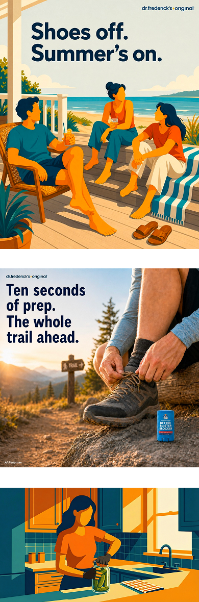
A consistent visual journey, designed from first impression to product understanding.
NATHAN SPOOR
CREATIVE DIRECTOR