Corporate Rebrand
Creative Direction · Brand Design · Design System
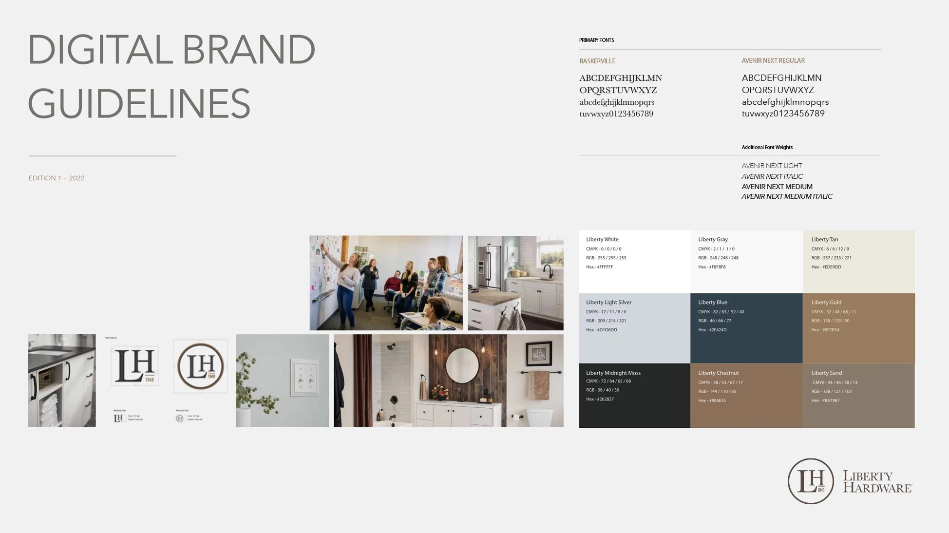
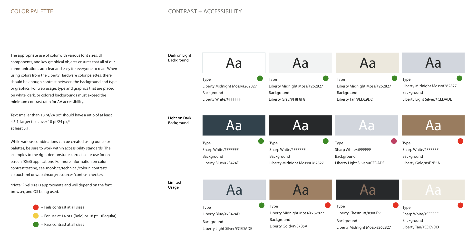
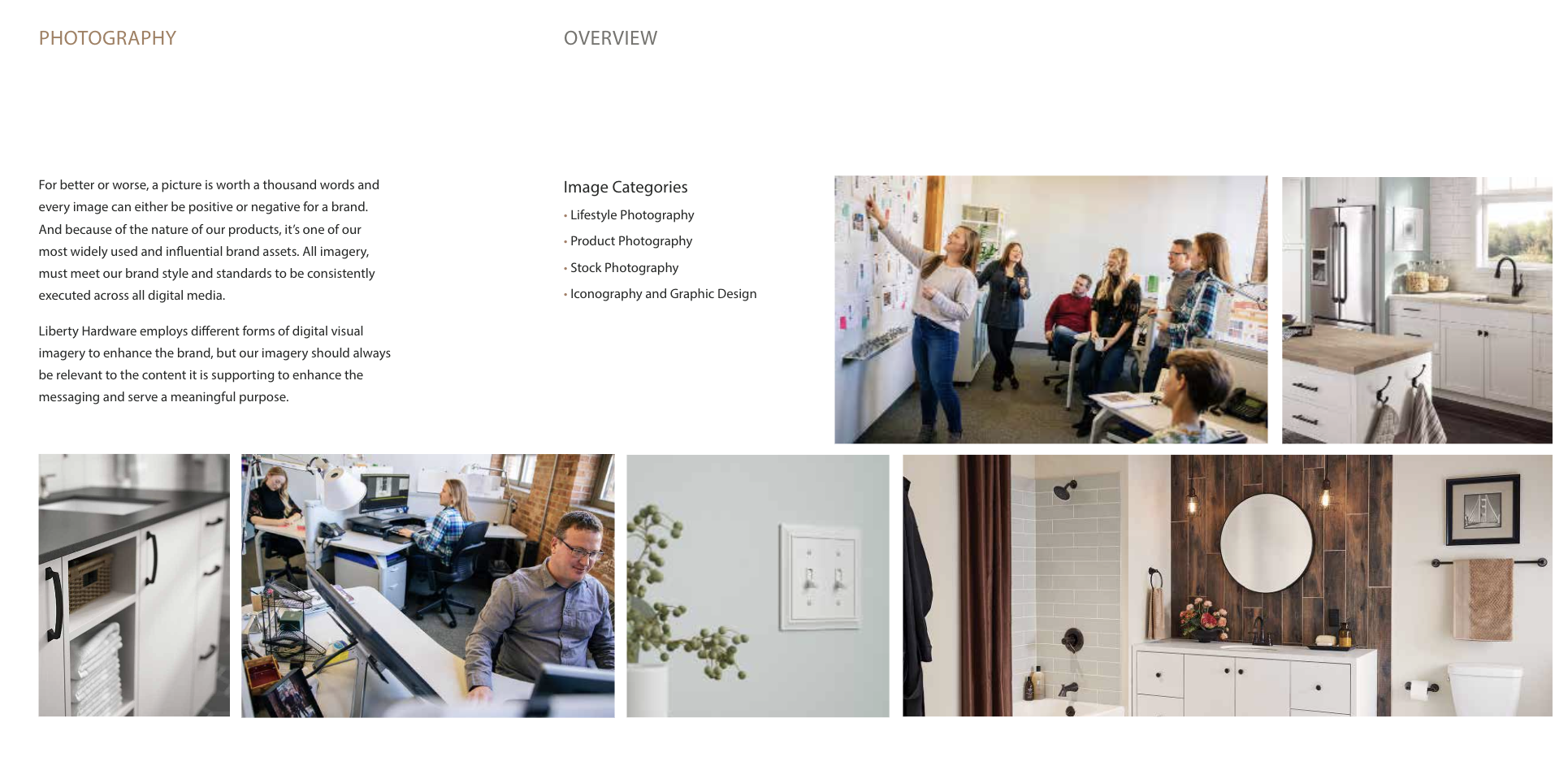
Liberty needed a visual language that could express its heritage and work across contemporary brand applications. I explored distinct creative territories, helped define the chosen direction, and developed guidance for color, photography, social expression, and everyday use. The resulting guidelines gave other teams a direction they could carry forward.

01 / FINDING THE TERRITORY
Exploring what the brand could become.
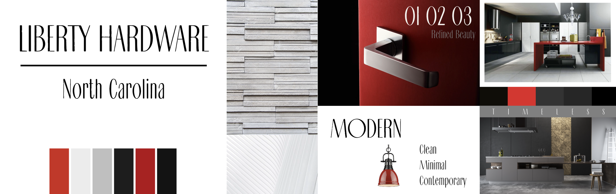
Rather than beginning with a predetermined aesthetic, the process tested a range of visual directions across typography, color, material, photography and interior context.
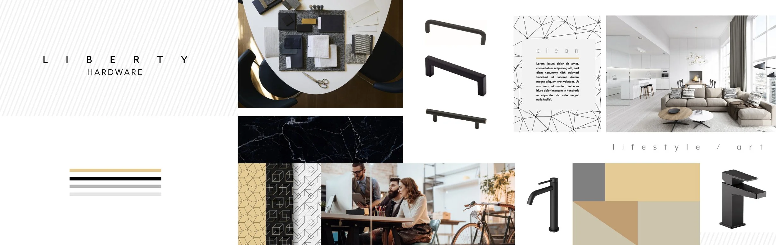
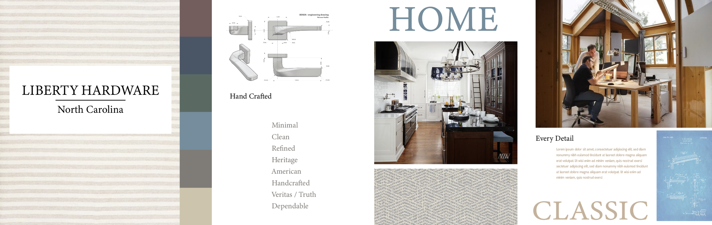
The client favored elements from the first two directions. I combined those selections into the foundation for the final visual system.
02 / DEFINING THE LANGUAGE
Turning a direction into a system.

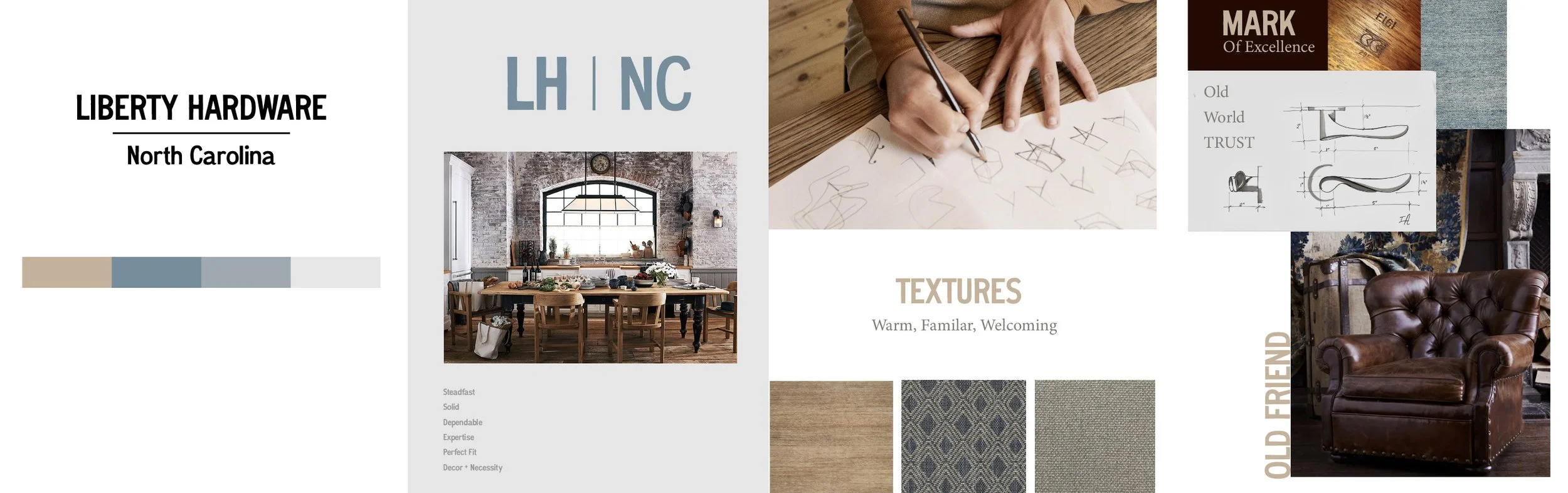
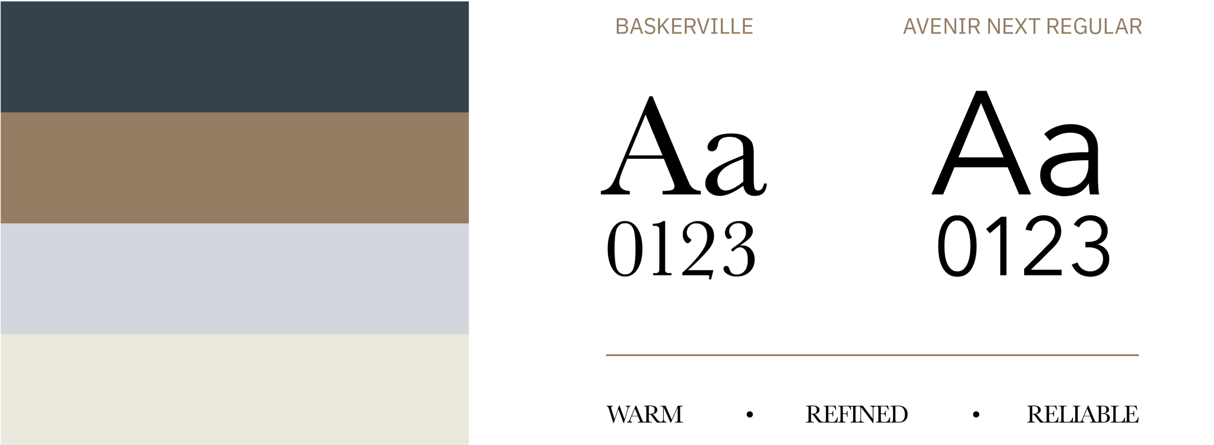
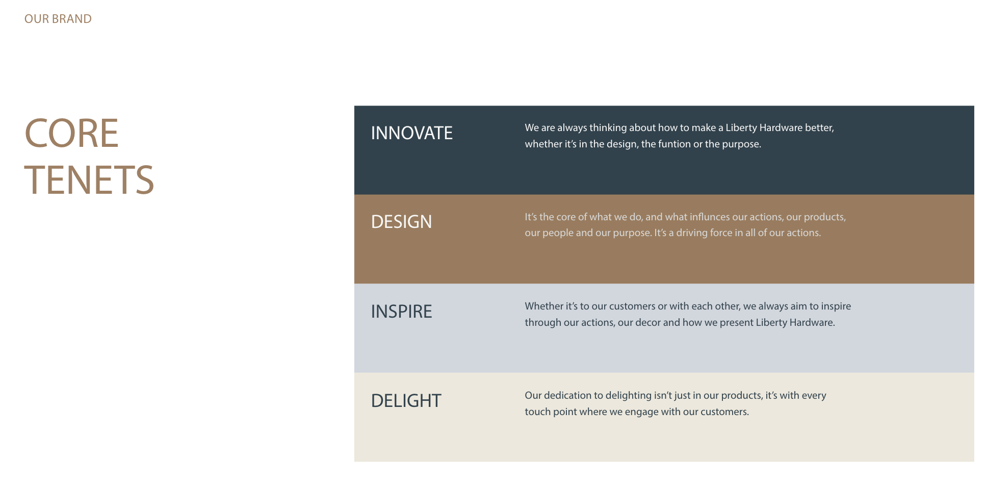
The selected territory established a more refined visual language built around the relationship between product, material and home.
Typography, color, imagery and graphic elements were developed to work together as a recognizable system rather than a collection of individual assets.
03 / BUILDING FOR USE
Creating consistency without making everything the same.
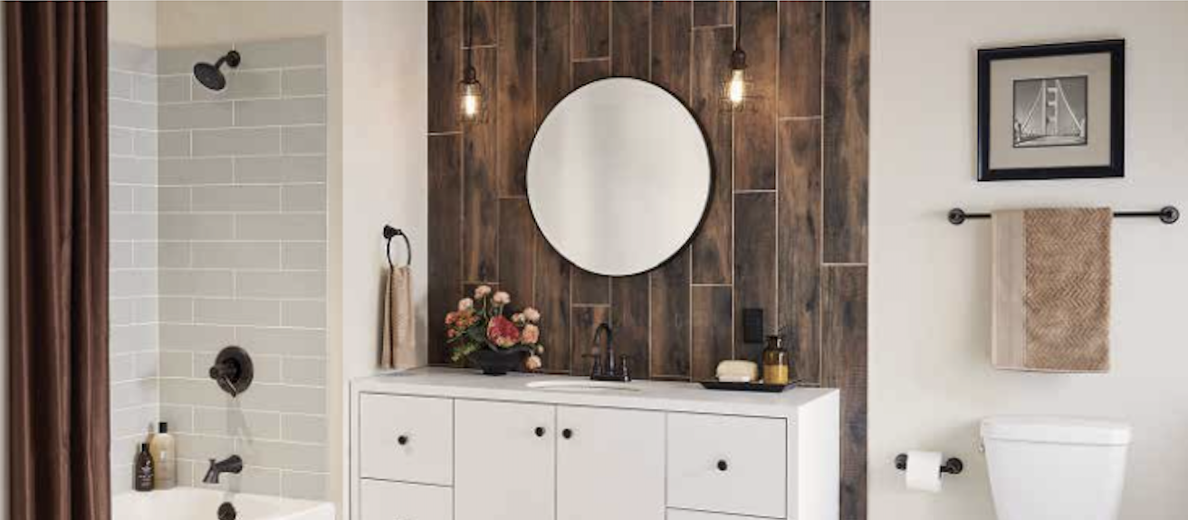
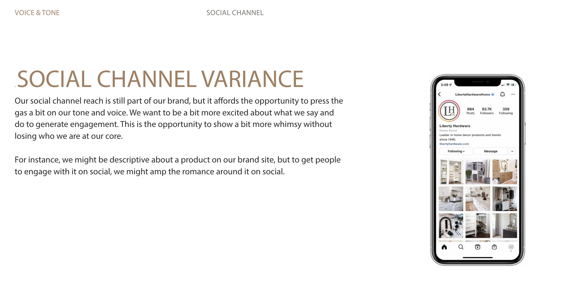
The resulting guidelines translated the brand across product imagery, photography, digital experiences and social channels.
The goal was not rigid uniformity, but enough structure for different expressions of the brand to still feel unmistakably connected.
NATHAN SPOOR
CREATIVE DIRECTOR
