
Turning a fragmented product range into a recognizable brand.
Creative Direction · Brand Identity · Packaging · Photography · eCommerce · Design Systems
Dr. Frederick’s Original had strong products, but its packaging, messaging, and imagery had grown apart. As Creative Director, I connected those pieces through a shared brand direction, working with leadership and cross-functional partners to build a system the team could use as the product range expanded.

01 / THE CHALLENGE
The brand needed to catch up with its products.
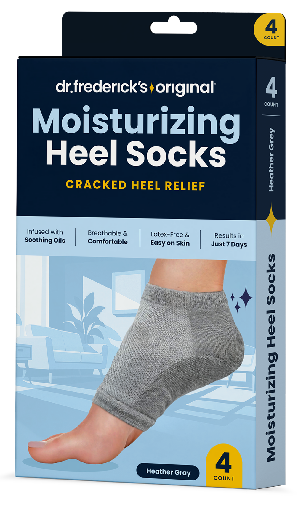
Packaging and communications had developed independently as DFO grew. Individual products needed to communicate their benefits clearly while contributing to a recognizable family.
I began by looking at where the packaging and communications had grown apart. That helped define what the new identity needed to do: make individual products easier to understand and bring the range together as one brand.
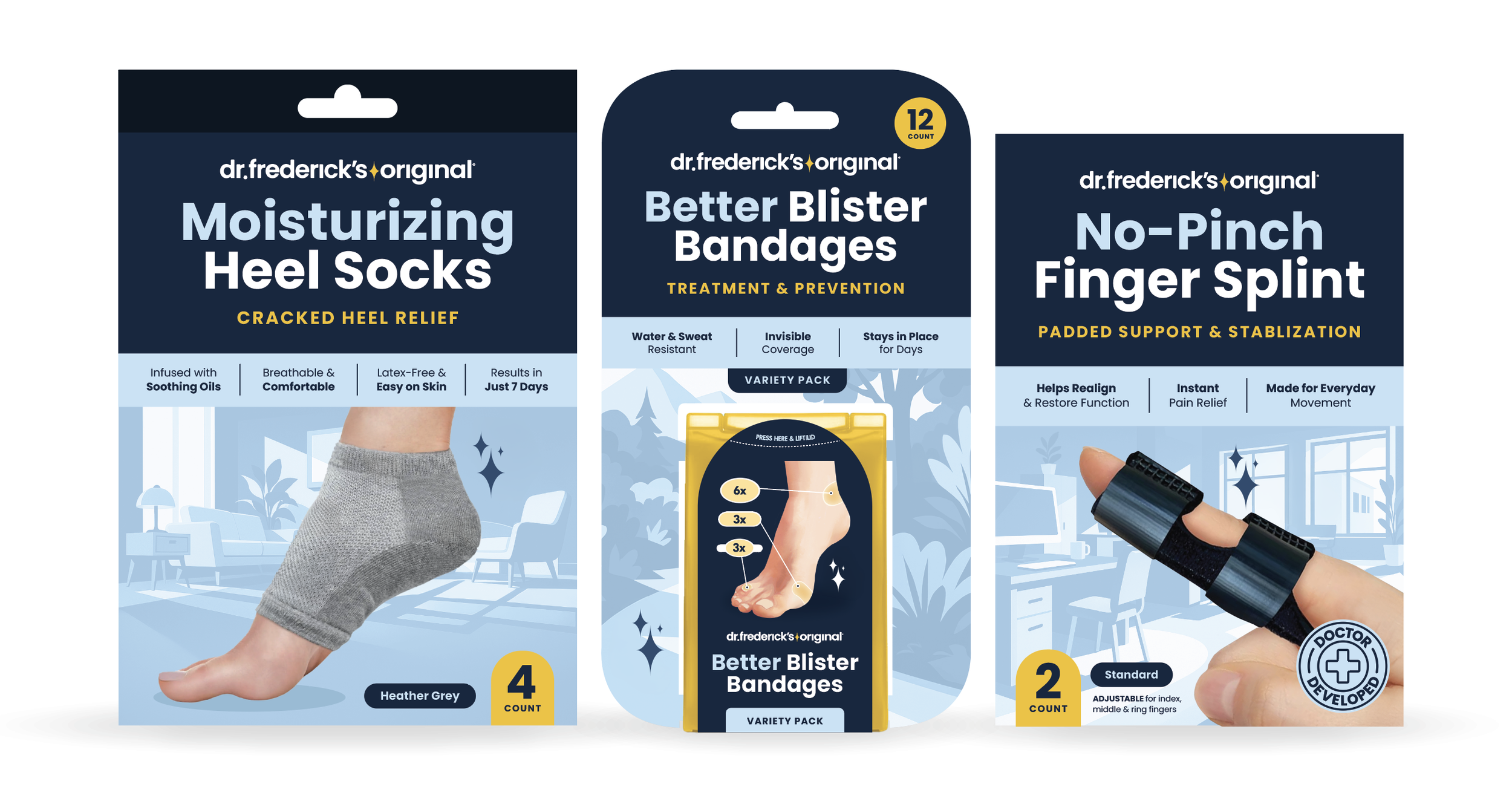
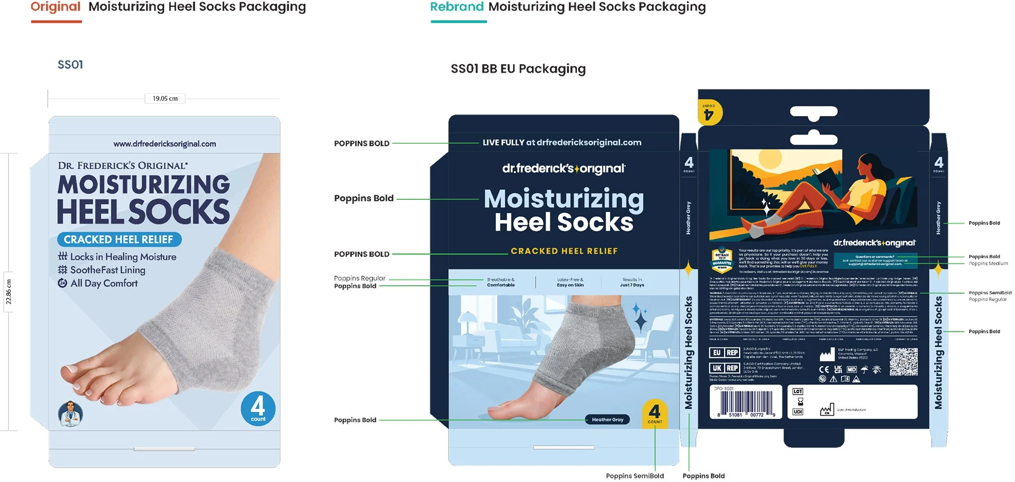
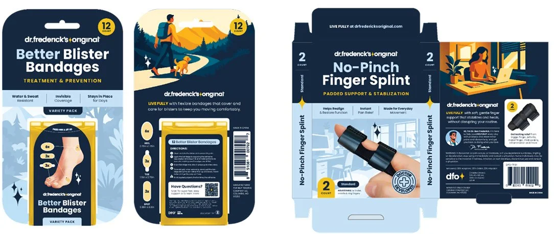
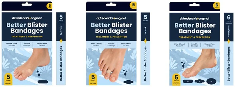
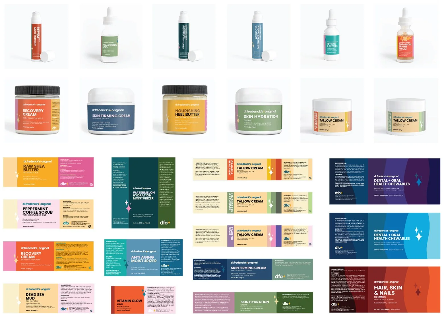
The unified packaging direction.
02 / THE IDENTITY
Give the name a stronger visual identity.
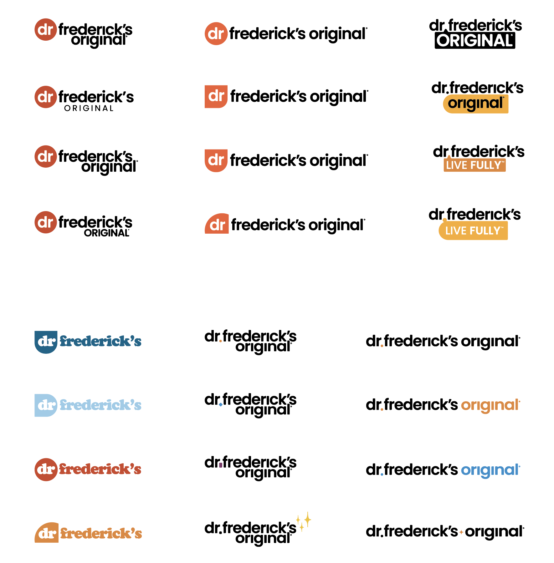
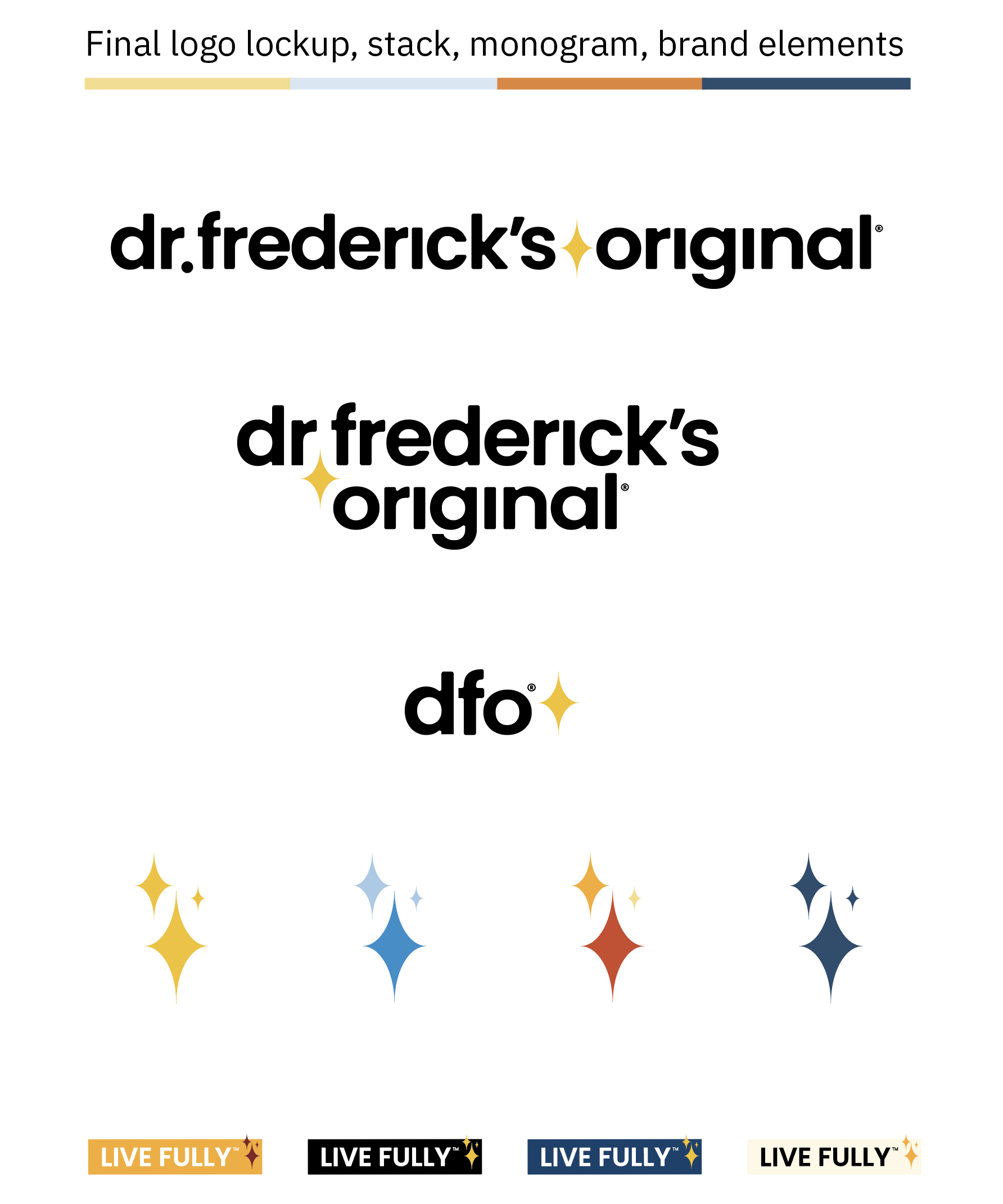
We kept the name and rebuilt the visual identity around it. I developed a simpler wordmark that could work across packaging and digital applications.
I introduced an elongated sparkle as punctuation in the wordmark and as a separate brand element. Its shape distinguished it from Gemini’s similar symbol, and it worked alongside the DFO lettermark or monogram. For standalone use, I developed a three-sparkle arrangement with a more distinctive presence.
In illustrations, the sparkles added movement and energy, connecting the identity to scenes of activity and everyday life.
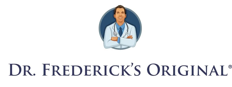
A new identity for an established name.
Wordmark and symbol explorations shaped a more distinctive brand presence across packaging and digital.
03 / THE PACKAGING SYSTEM
Make the product range feel like one brand.
Packaging put the direction to work. I developed a shared approach to typography, color, hierarchy, and product information that could accommodate different products while keeping the family recognizable.
Testing, polling, and team reviews informed the refinements: what customers needed to notice first, how each product could distinguish itself, and what needed to remain consistent.
The resulting framework gave the team a starting point for extending the range.
04 / THE CUSTOMER EXPERIENCE
Show how the product fits into everyday life.

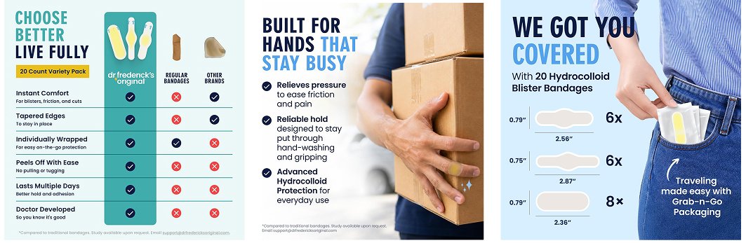
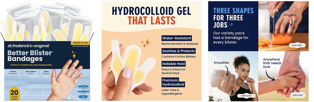
I directed original photography to show the products in use, with attention to how they fit, function, and feel on the body.
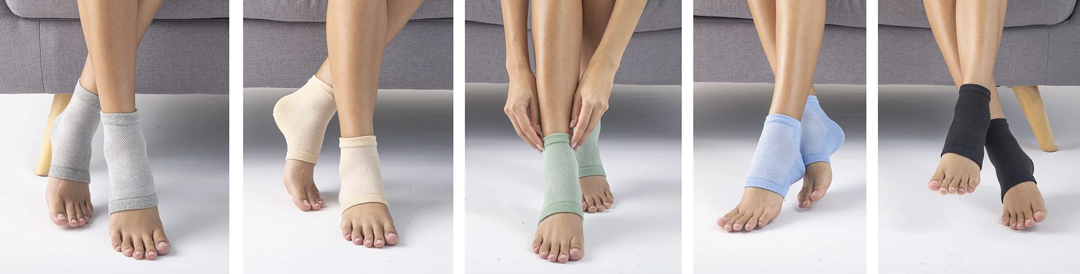
Turning photography into a product story.
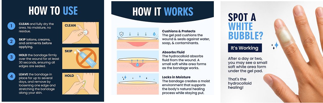
I brought the photography into a shared content system, combining product benefits, usage guidance, and a consistent visual hierarchy. That structure gave each image a clear job while keeping the sequence recognizable as DFO.
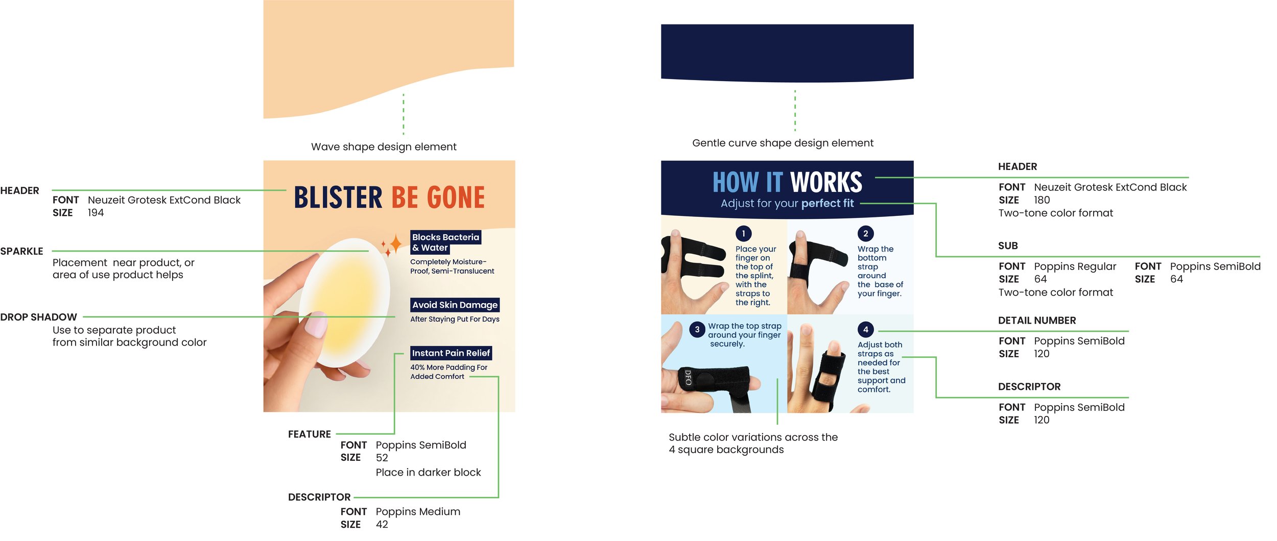
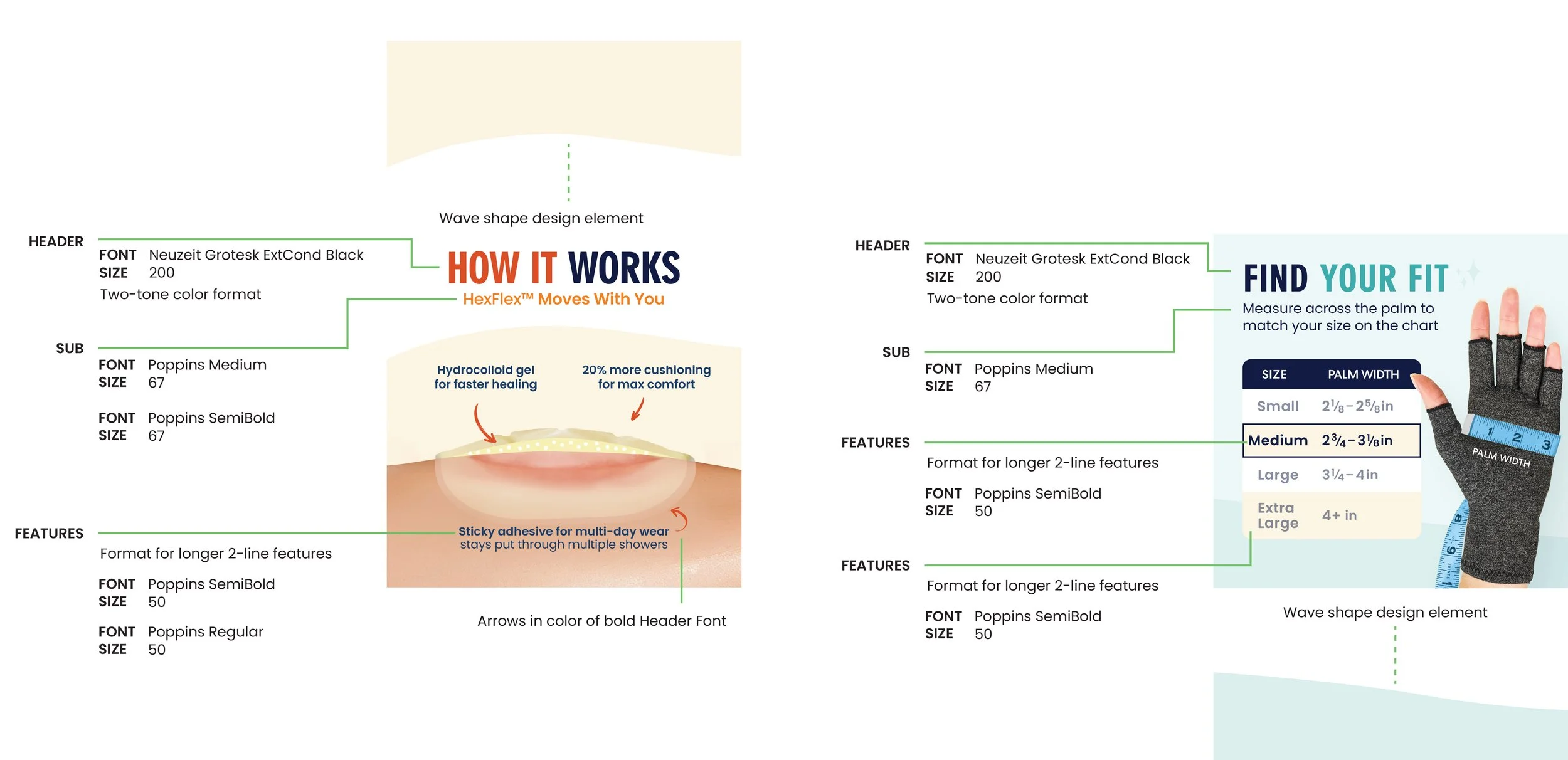
Building the story across the sequence.
On Amazon, the system connected the main product image with supporting details and education. Each image added something useful, helping customers understand what the product does and how it fits into their lives.
05 / EQUIPPING THE TEAM
Give the team a system they could build on.
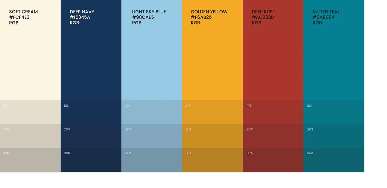
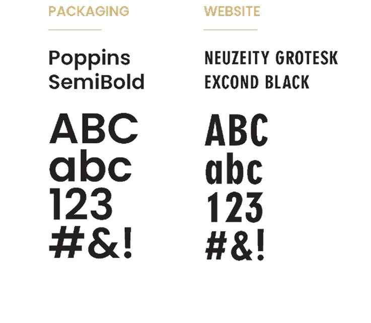
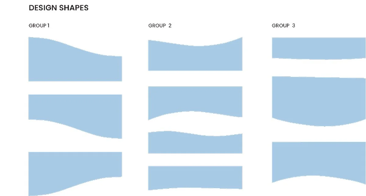
I developed shared guidance for typography, color, iconography, illustration, and product communications, working with leadership and cross-functional partners to connect the brand to daily production needs.
Sharing the reasoning behind those choices gave people a basis for making decisions as new needs emerged. Reusable frameworks helped the team carry the direction across products and channels.
Brand Iconography
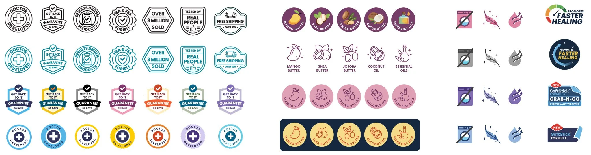
A shared icon library gave the team a consistent way to communicate product features and benefits across packaging and digital content.
Brand Illustration
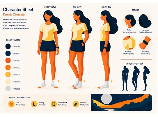
I developed character sheets and style rules to make the illustration approach repeatable. These references gave the team a starting point for extending the visual language across print, web, email, and internal communications.

AI-assisted workflow
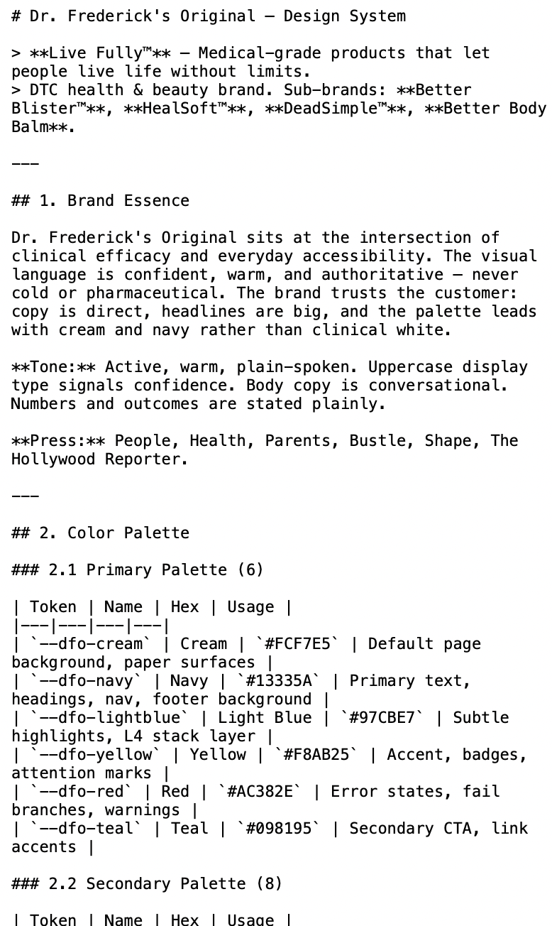
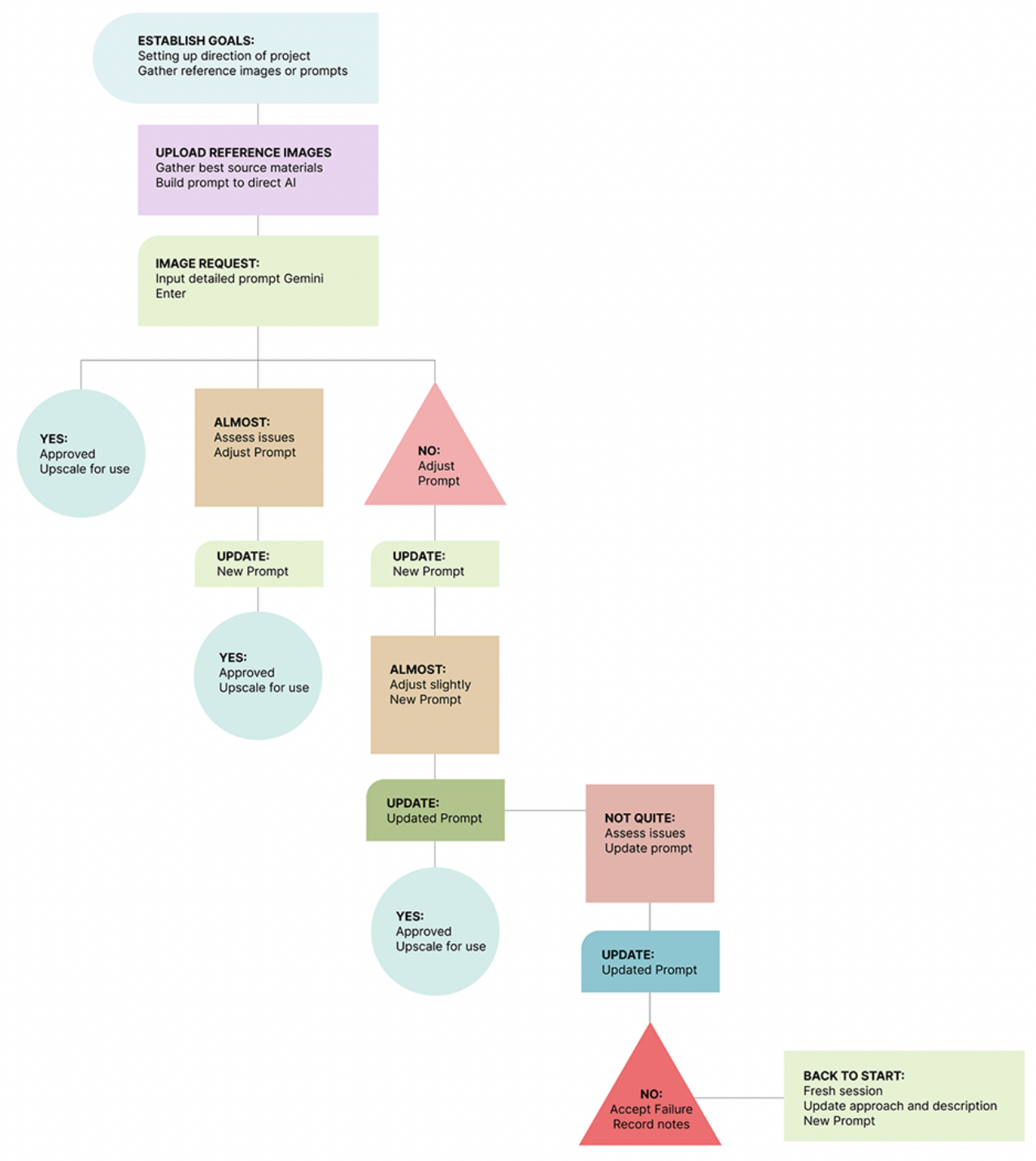
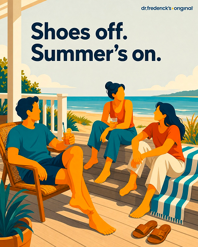
I introduced structured brand guidance and AI-assisted workflows to support exploration and iteration. Defined inputs and human review kept the process grounded in the brand’s visual standards.
BRAND GUIDANCE → CREATIVE WORKFLOW → REVIEWED OUTPUT
Brand guidance
Visual standards and creative principles organized as reference material for AI-assisted work.
Creative workflow
A sequence of inputs, exploration, and review for developing new assets.
Reviewed output
Selected examples showing how the guidance carries through into finished work.

06 / WHAT CHANGED
A connected brand.
A shared way to build it.
DFO gained a consistent visual foundation across identity, packaging, photography, and Amazon content. Shared standards and reusable tools gave the team a starting point for new products and communications.
NATHAN SPOOR
CREATIVE DIRECTOR
