

THE CHALLENGE
Cognosante came to the table with a request that began with asking for a new approach to their images and concluded with brand style refresh. The ask included image use and style, accounting for their three business units (not represented until now), color use, icon consistency, and simply improving B2B client experience on the site.

THE KEY TO A NEW STYLE
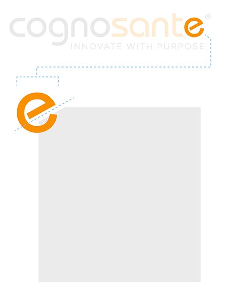
Cognosante - before starting in on how the imagery could be recast I noticed an opportunity… the company logo had one single diagonal element. Using this as catalyst for making a small change in the photo box, I created an element that subtly tied the core of the brand through each area.
This element in place, it was time to address how the three business units would be handled. This was achieved with pairing the logotype with a + and the business unit. The client was ecstatic. Sometimes it just takes a small adjustment to achieve the goal.

PHOTOGRAPHY

Imagery selected to showcase the consistent lifestyle photography with a warm and harmonious “honest” approach with each addressing the three business units.
Tools: Photoshop, Powerpoint
ROUGH COMPS

Comps built out to test new style approach and layout for the home page, showcasing the client’s needs for the new use of photography and addressing the three business units.
Tools: Photoshop, Illustrator
STYLE GUIDE
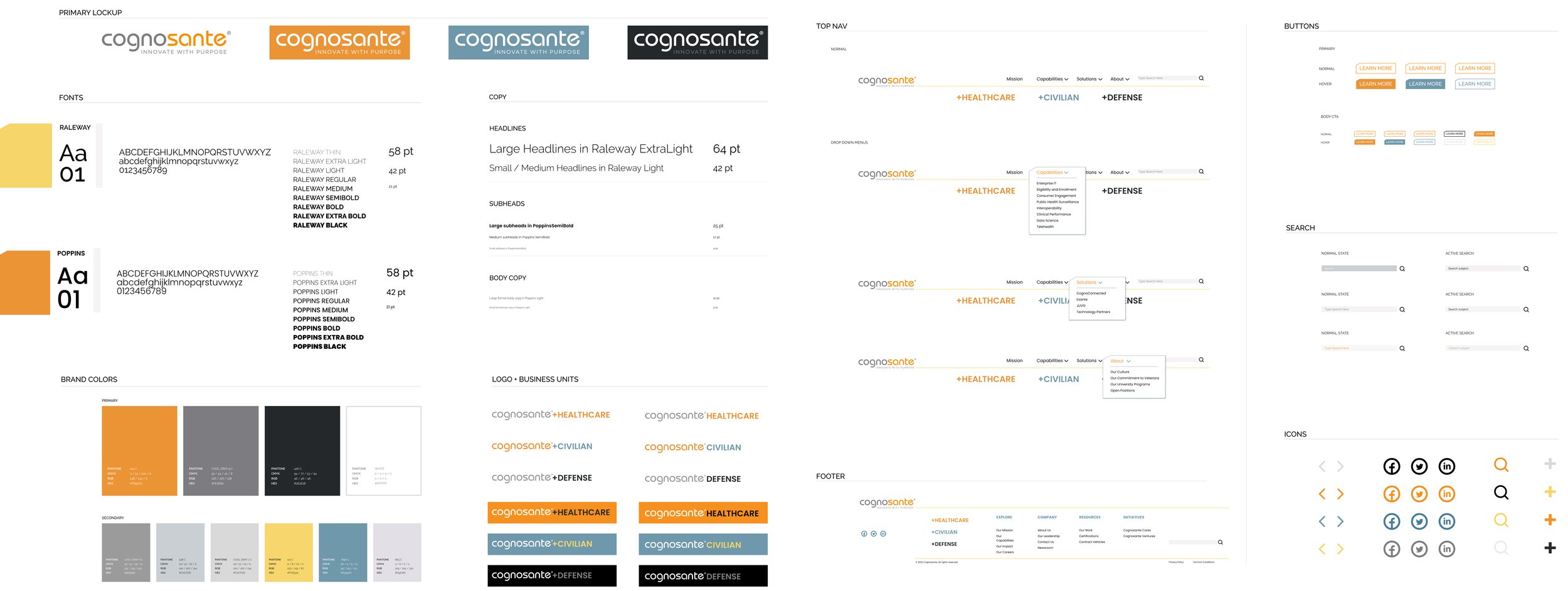

Final style guide elements.
Tools: Figma
WIREFRAMING

Full rework of the site flow and design: low fidelity freehand wires (left) and medium fidelity digital wires (right).
Tools: Procreate (left), Figma (right)
HIGH FIDELITY COMPS

Home page shares consistency with the three business units in the new design.
These final images showcase the brand’s newly engaging flow for more effective storytelling.
Tools: Figma
MOBILE

The brand had no mobile design, so that’s one area that I was able to assist in creating a necessary bridge to their B2B clientele.
Tools: Figma, Photoshop
Client: Cognosante
Creative Direction: Nathan Spoor
Agency: PACE Communications