
A taste for the unexpected.
Illustration / Packaging / Art Direction
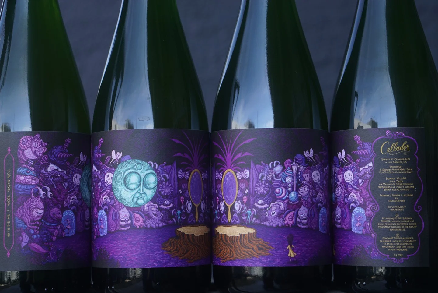
Cellador’s releases called for distinctive artwork that would reward a closer look and work as a complete bottle label. I developed visual worlds through drawing and exploration, then adapted them to the physical form of each release. Across the series, the approach remained consistent while the stories took different shapes.
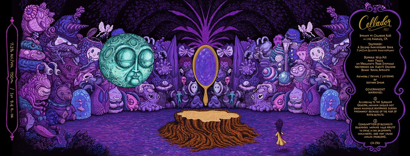
01 / FINDING THE CHARACTER
From the character of the release to a visual language.
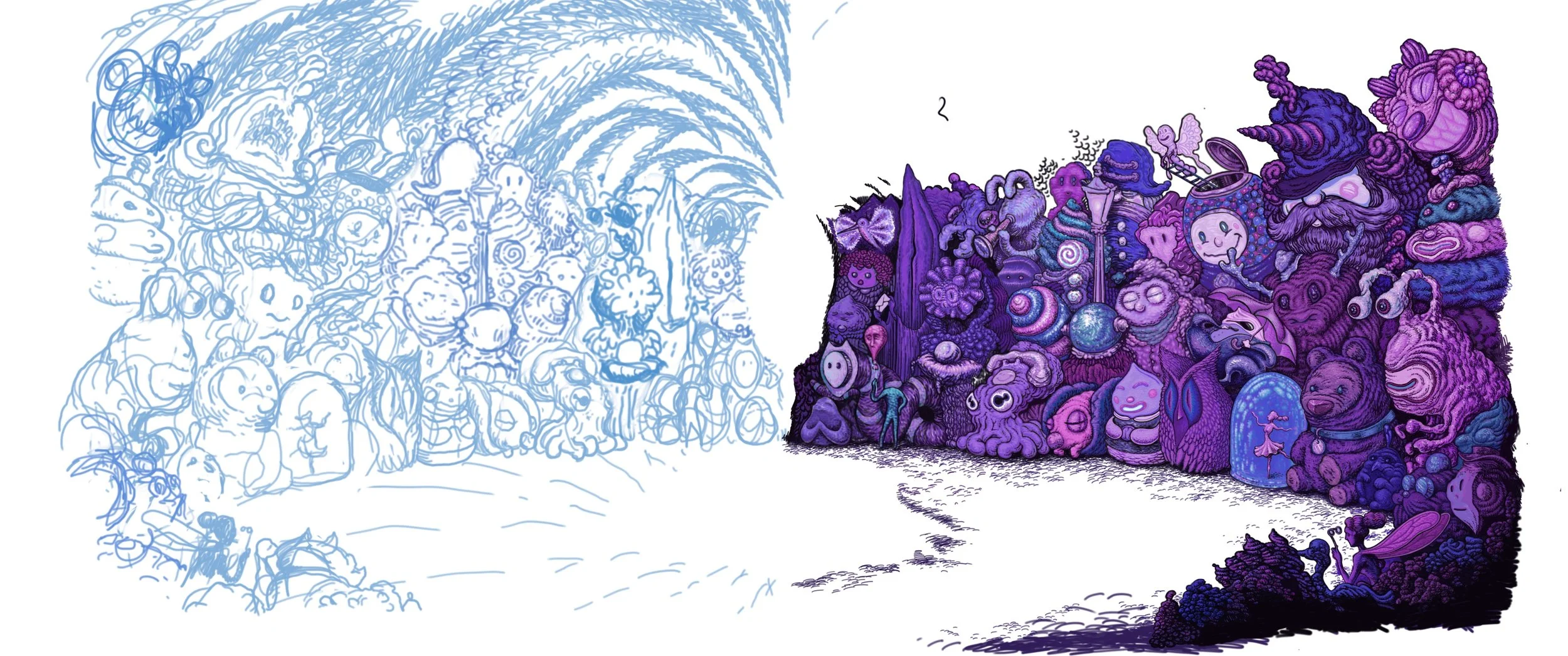
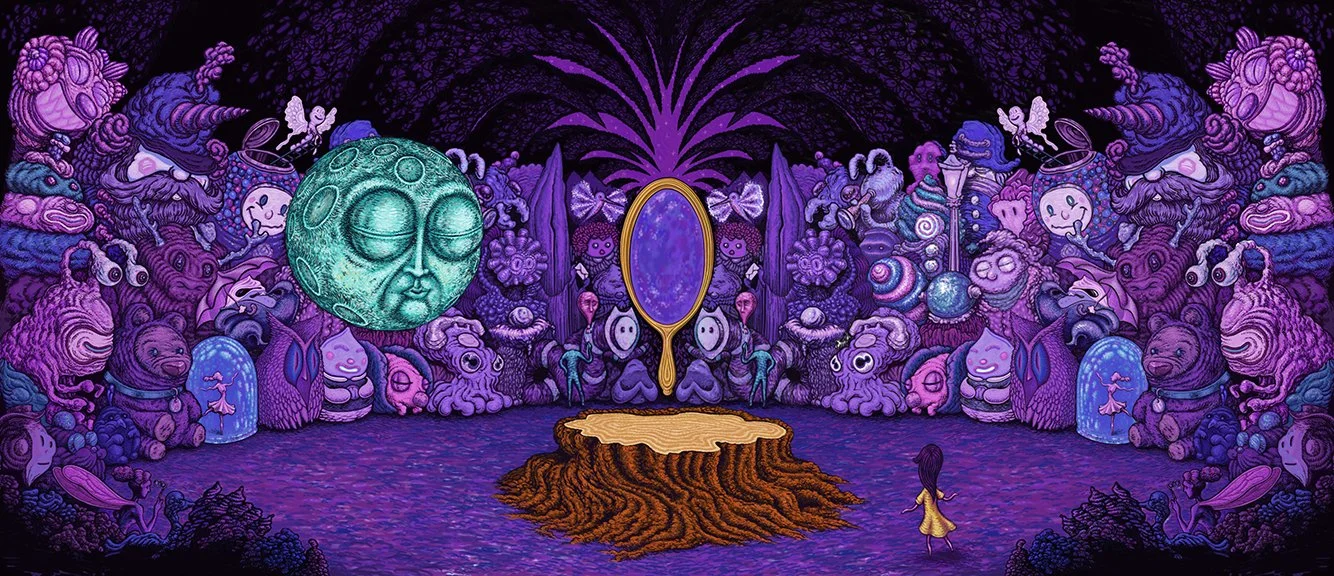
I partnered with Cellador Ales on artwork for its second anniversary release. The exploration began with characters, symbols, and strange little inhabitants. I developed these into a continuous environment that could wrap around the bottle and reward a closer look.
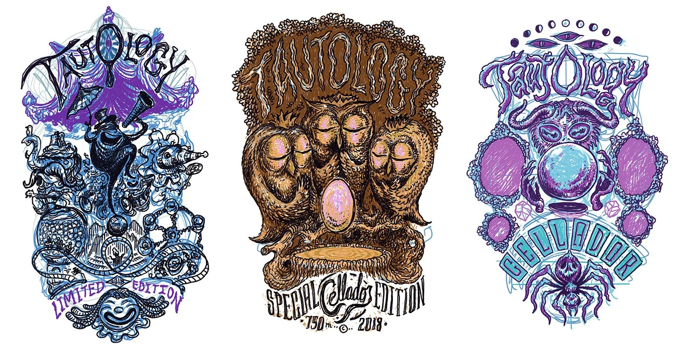
With an open brief, I used our early conversations to sketch three starting points. Sharing these helped clarify what resonated with the client and where to take the artwork next.
02 / EXPANDING THE PALETTE
A visual language that could change without losing its character.
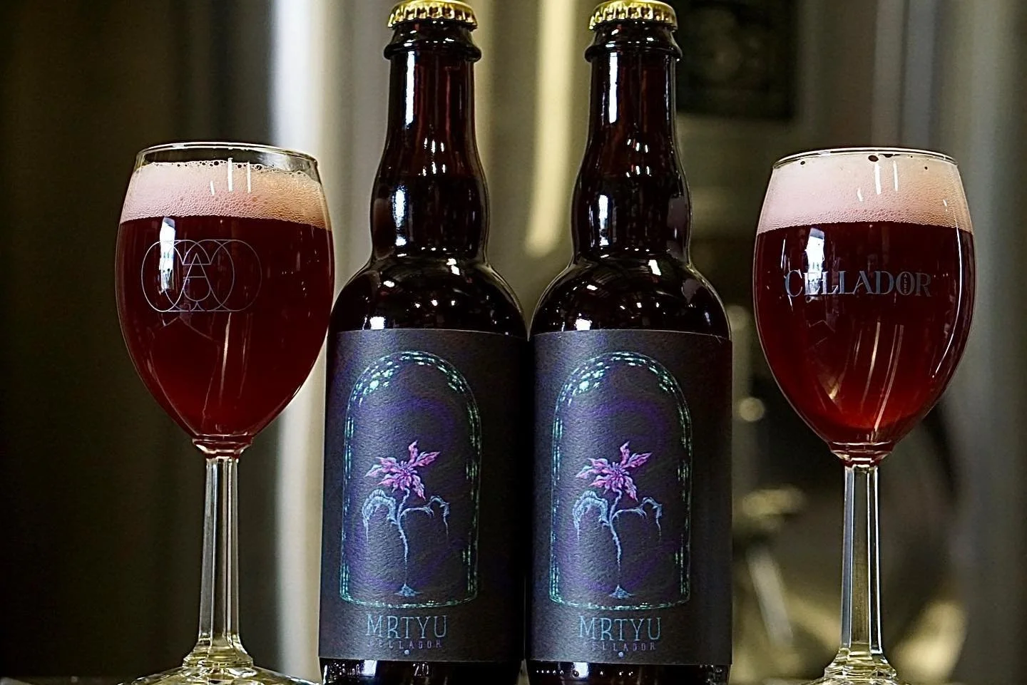
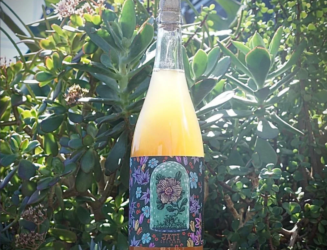
Later anniversary releases became opportunities to revisit the collaboration without repeating it. Each label developed its own atmosphere and palette while retaining the dense, hand-built character of the original work.
MRTYU
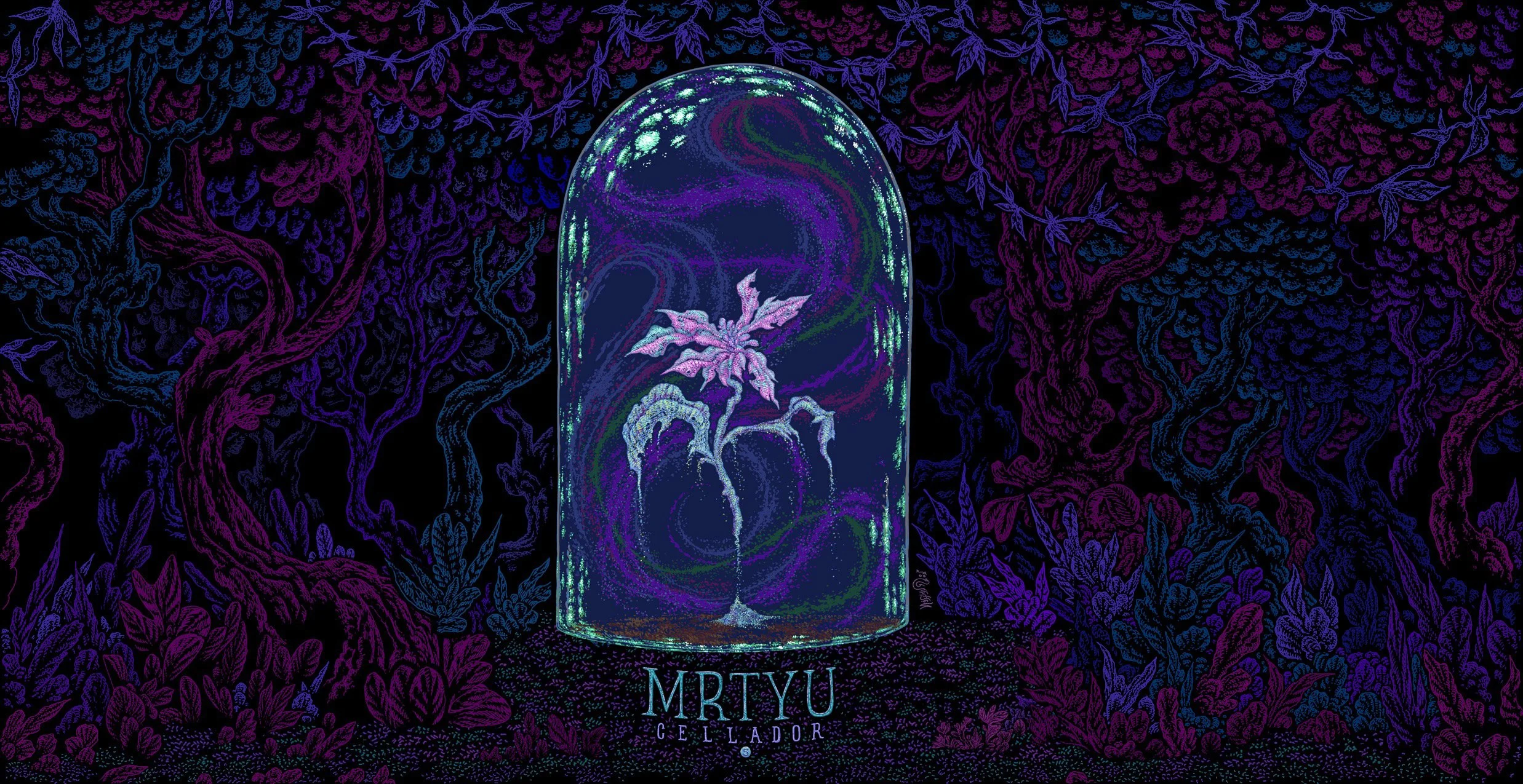
5 YEAR ANNIVERSARY / MRTYU
JATI
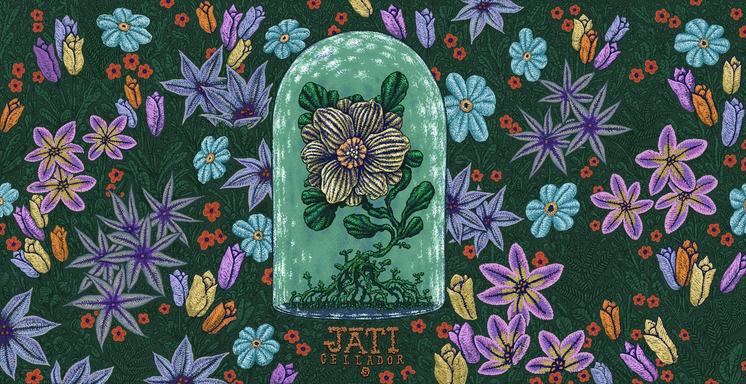
5.5 YEAR ANNIVERSARY / JATI
NATHAN SPOOR
CREATIVE DIRECTOR
